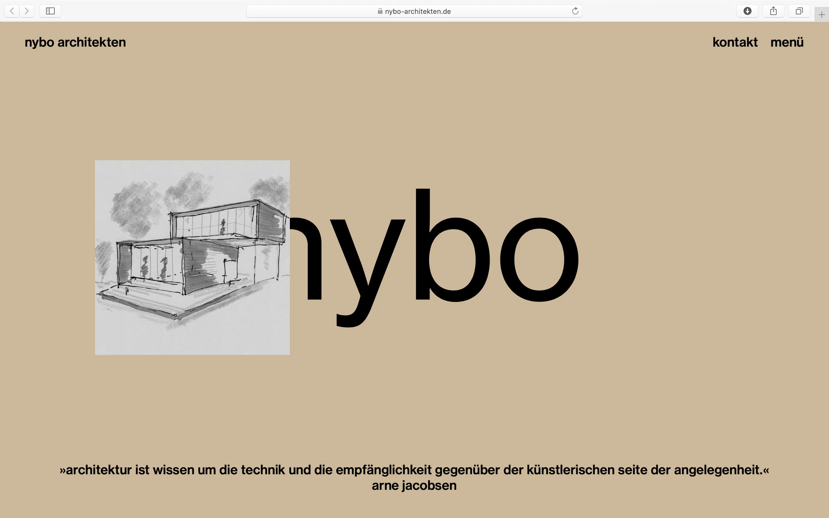
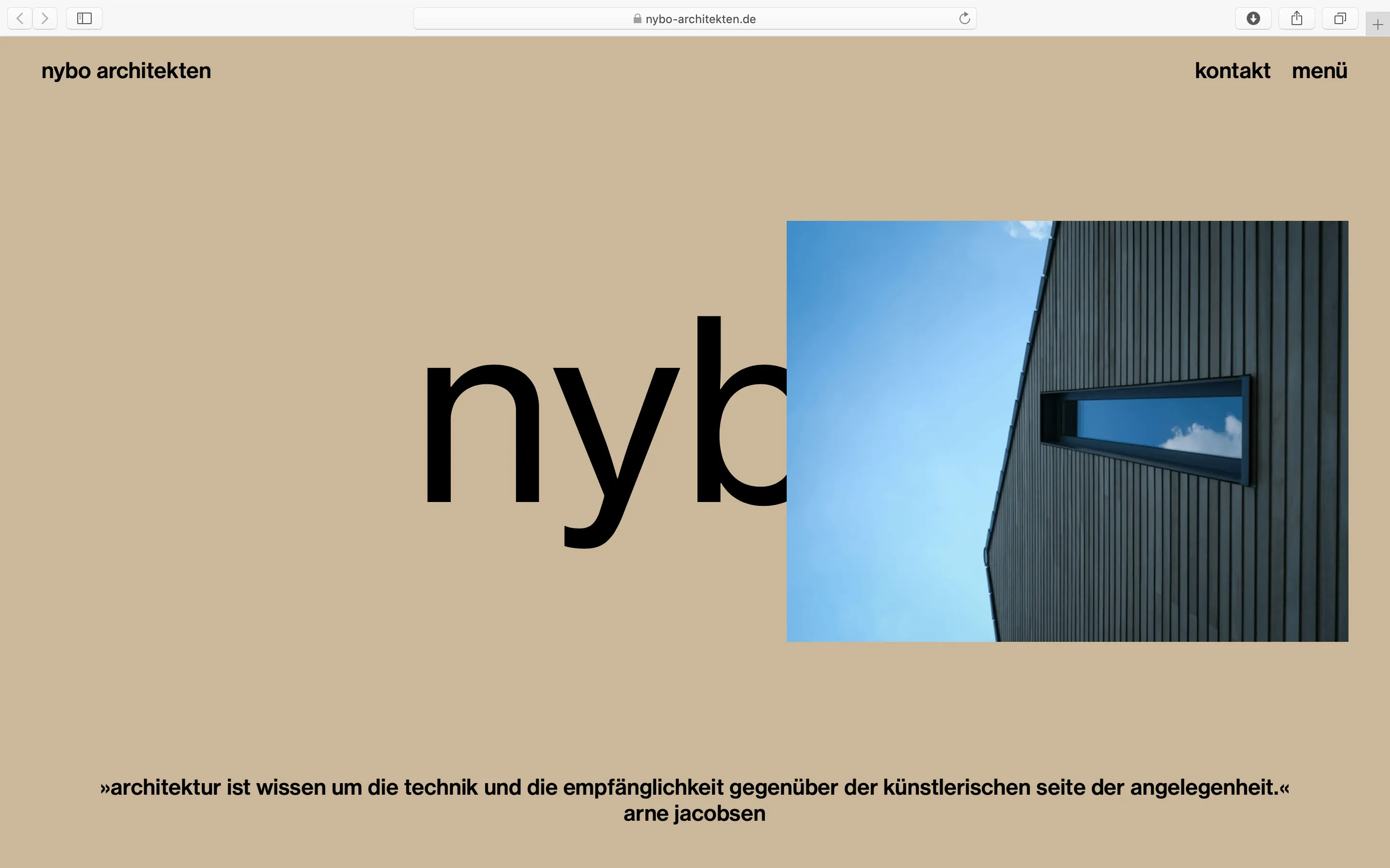
Scandinavian meets Hanseatic
A factual, but also atmospheric, new corporate design and a new website for the likeable architecture firm from Hamburg/Kiel.
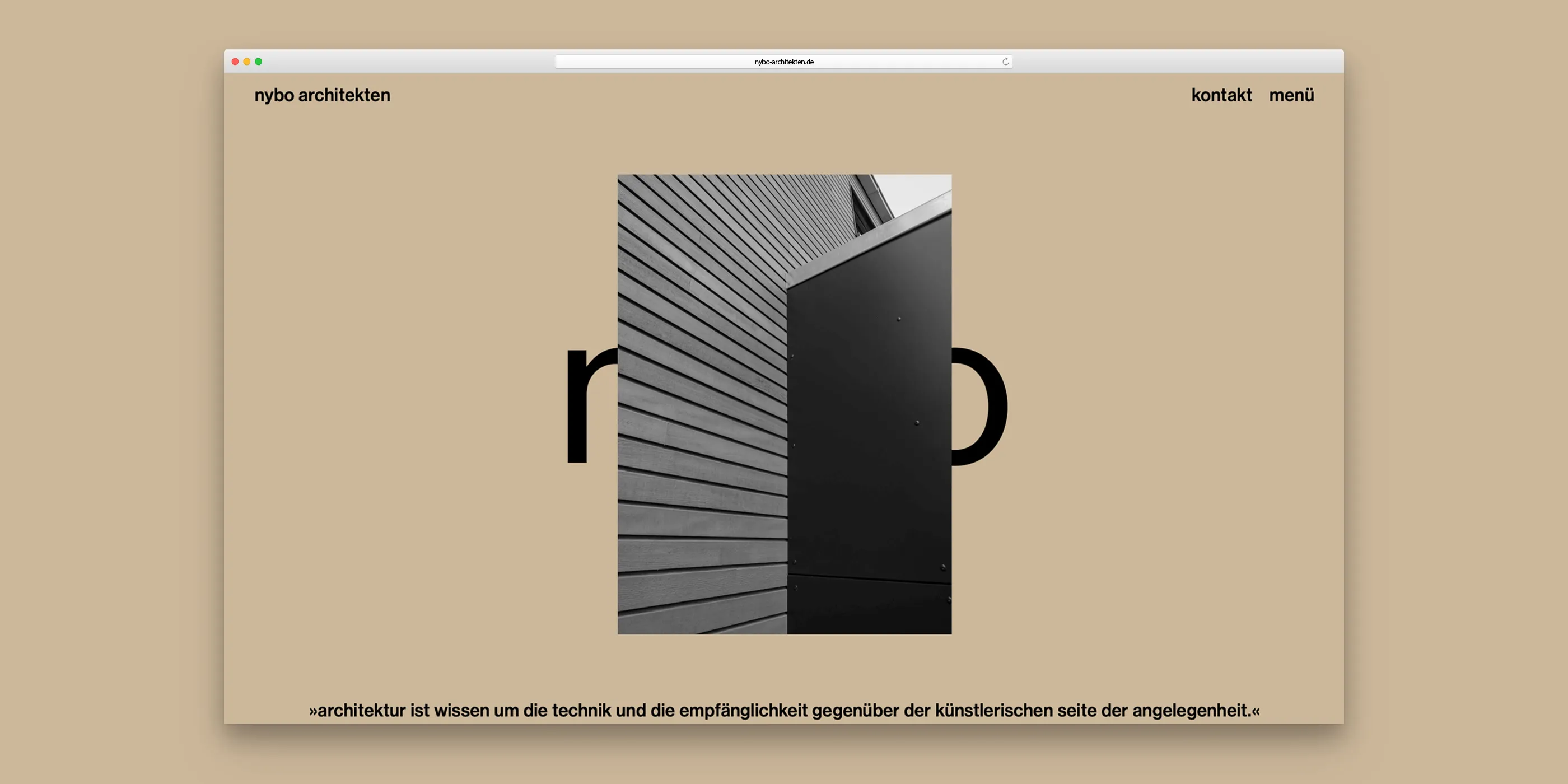


At first, it was just the desire to revise the website of nybo architekten. But in the course of the process, it quickly became clear that we would also revise the entire appearance of the architectural office.
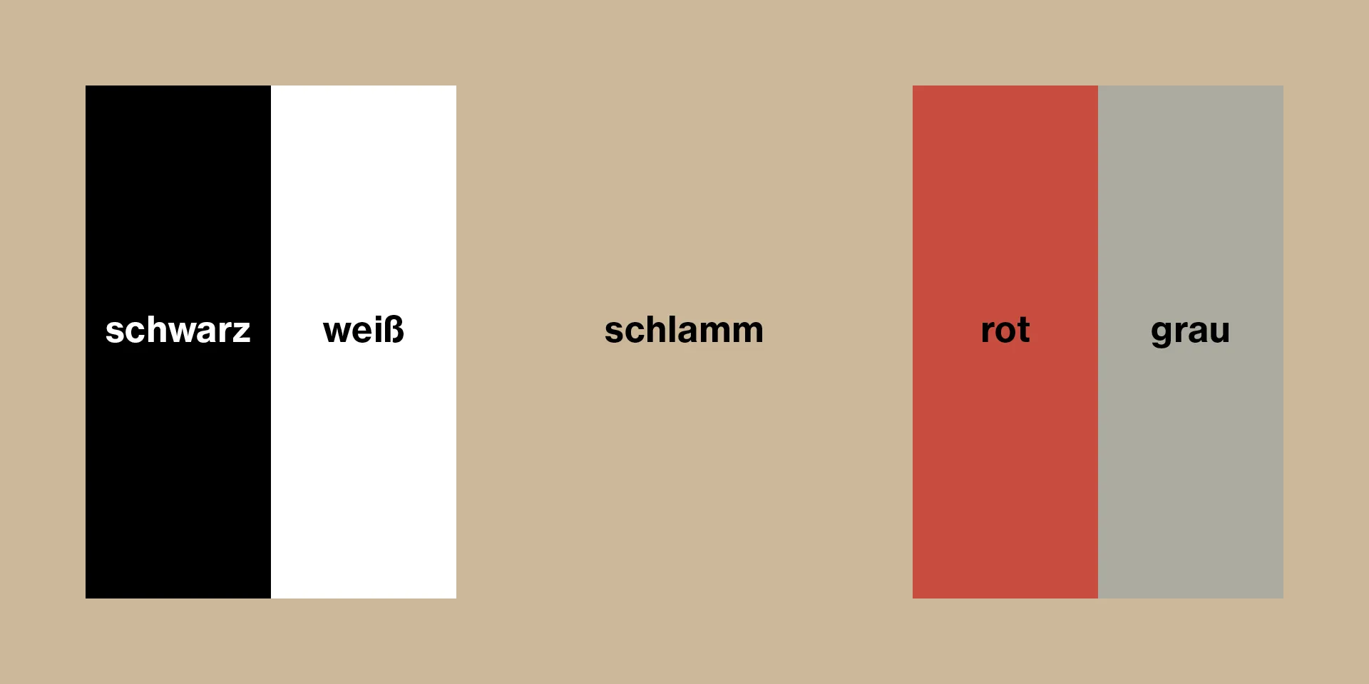
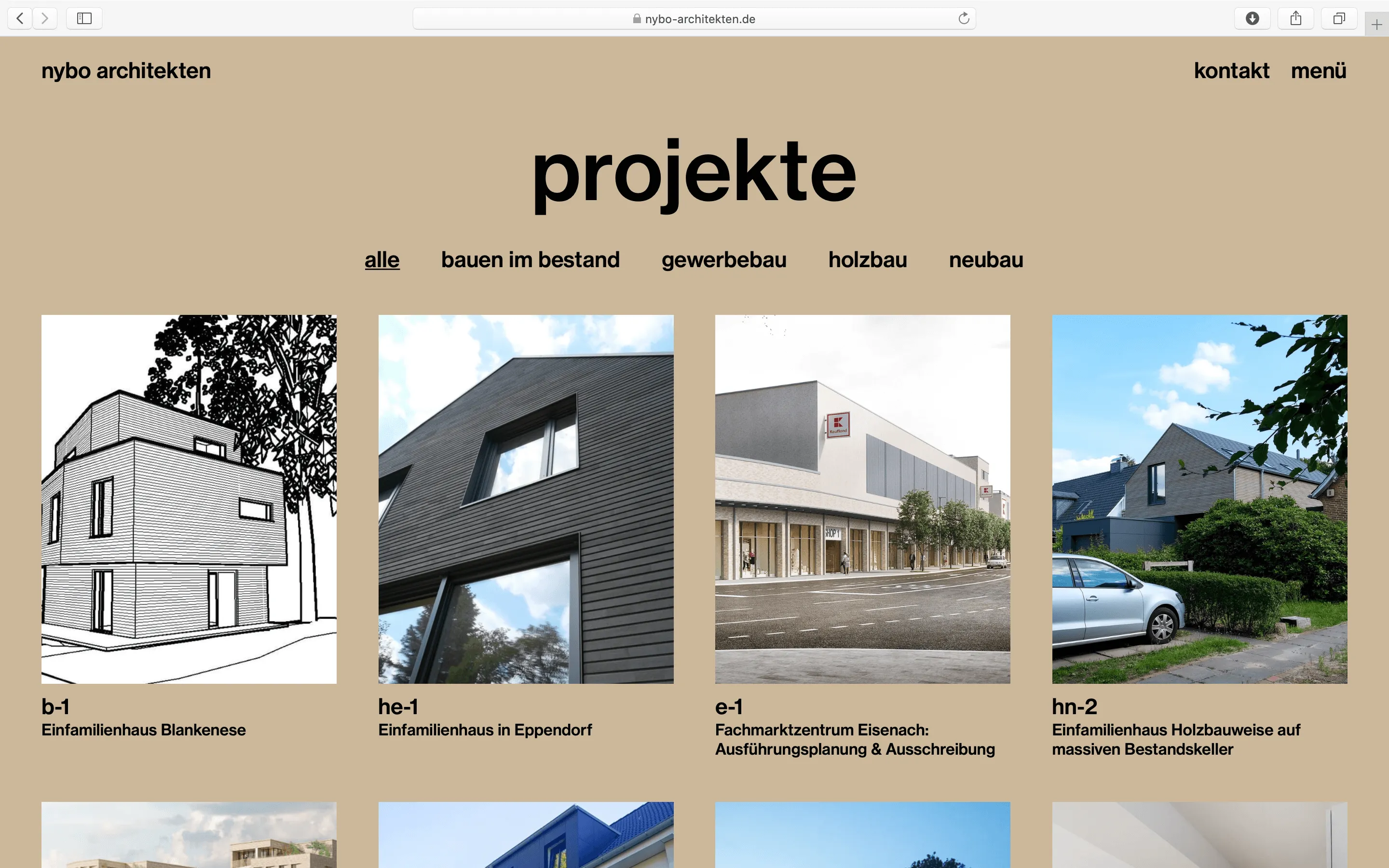
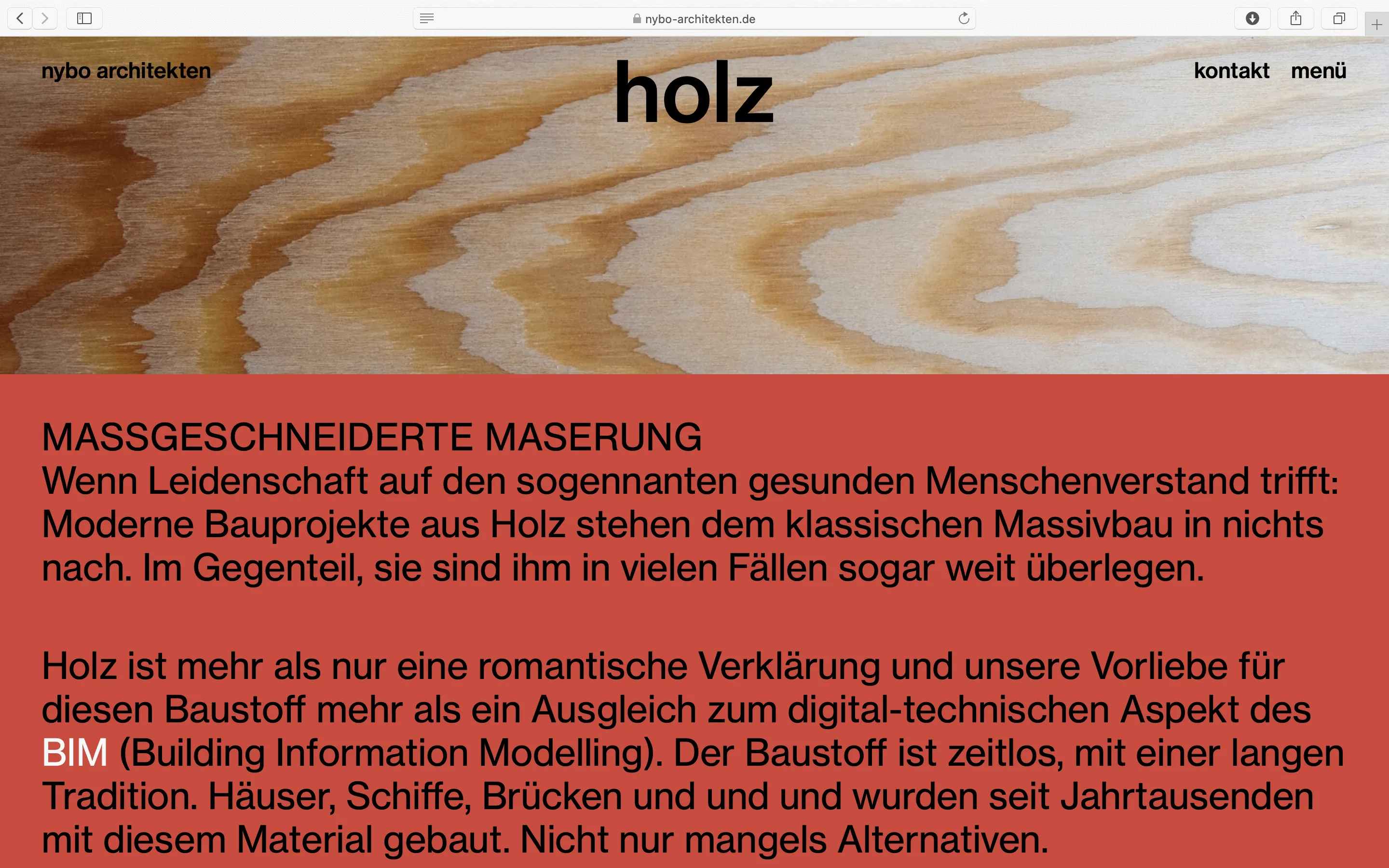
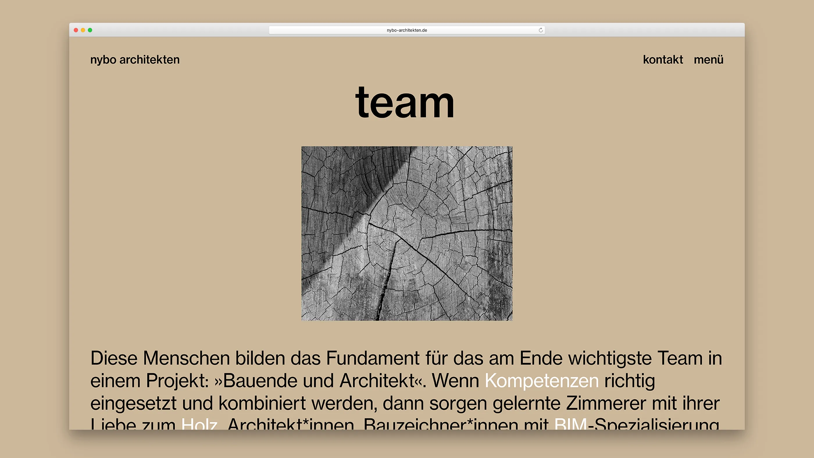
Our approach follows the classic commercial graphics of the 1960s. The very (self-)conscious use of type, colour and photography is complemented by a clear grid and tidy content. This is complemented by warm and earthy tones.
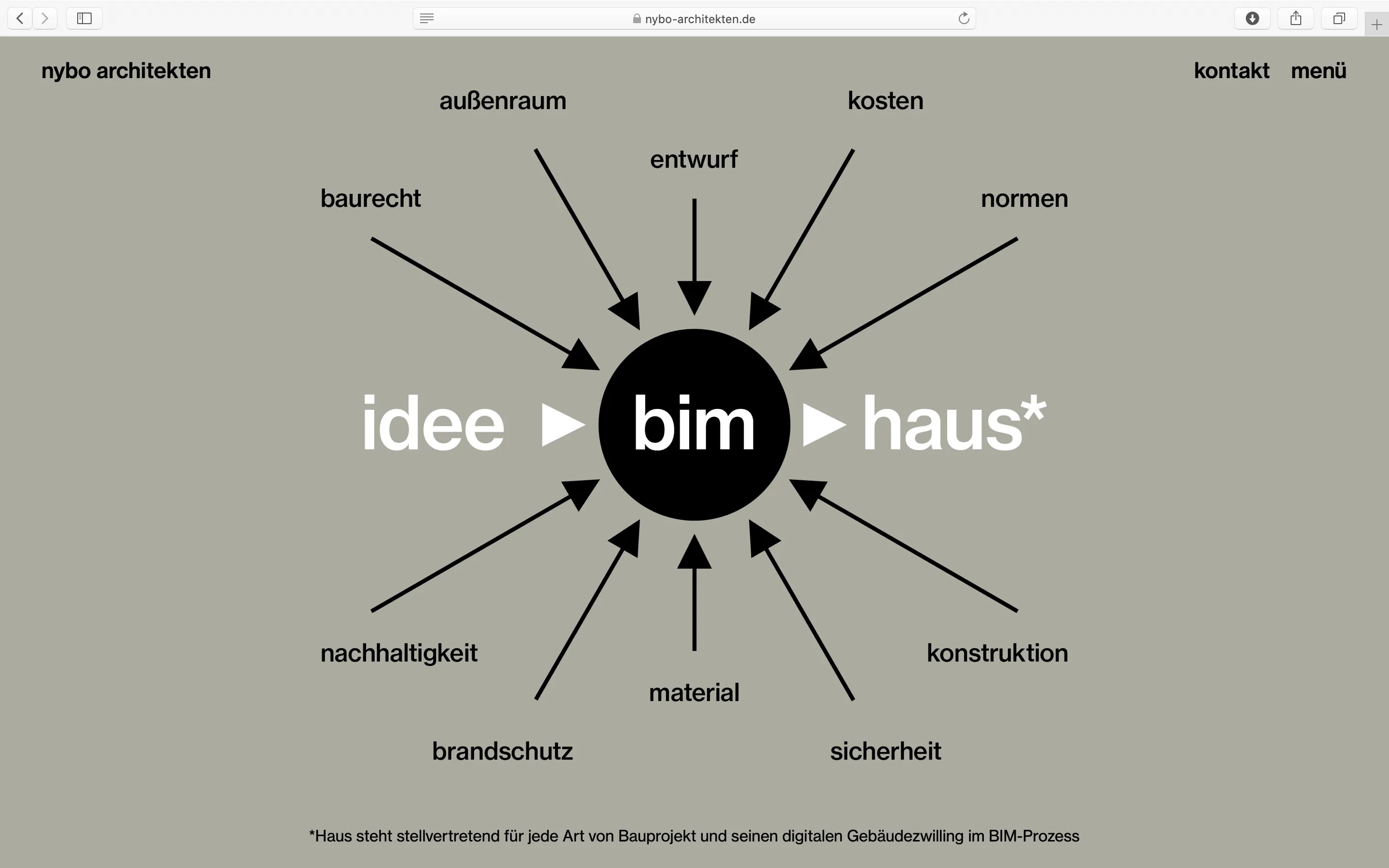
The website stages itself primarily through the use of type and the start page concept of simple terms under which navigation points are summed up. Very reduced, not playful, but nevertheless also somewhat »bold«. Expressive with few means.
For the technical implementation we chose Webflow for the first time. nybo architekten and we are equally enthusiastic about the flexibility and efficiency in handling and process.


.jpg)