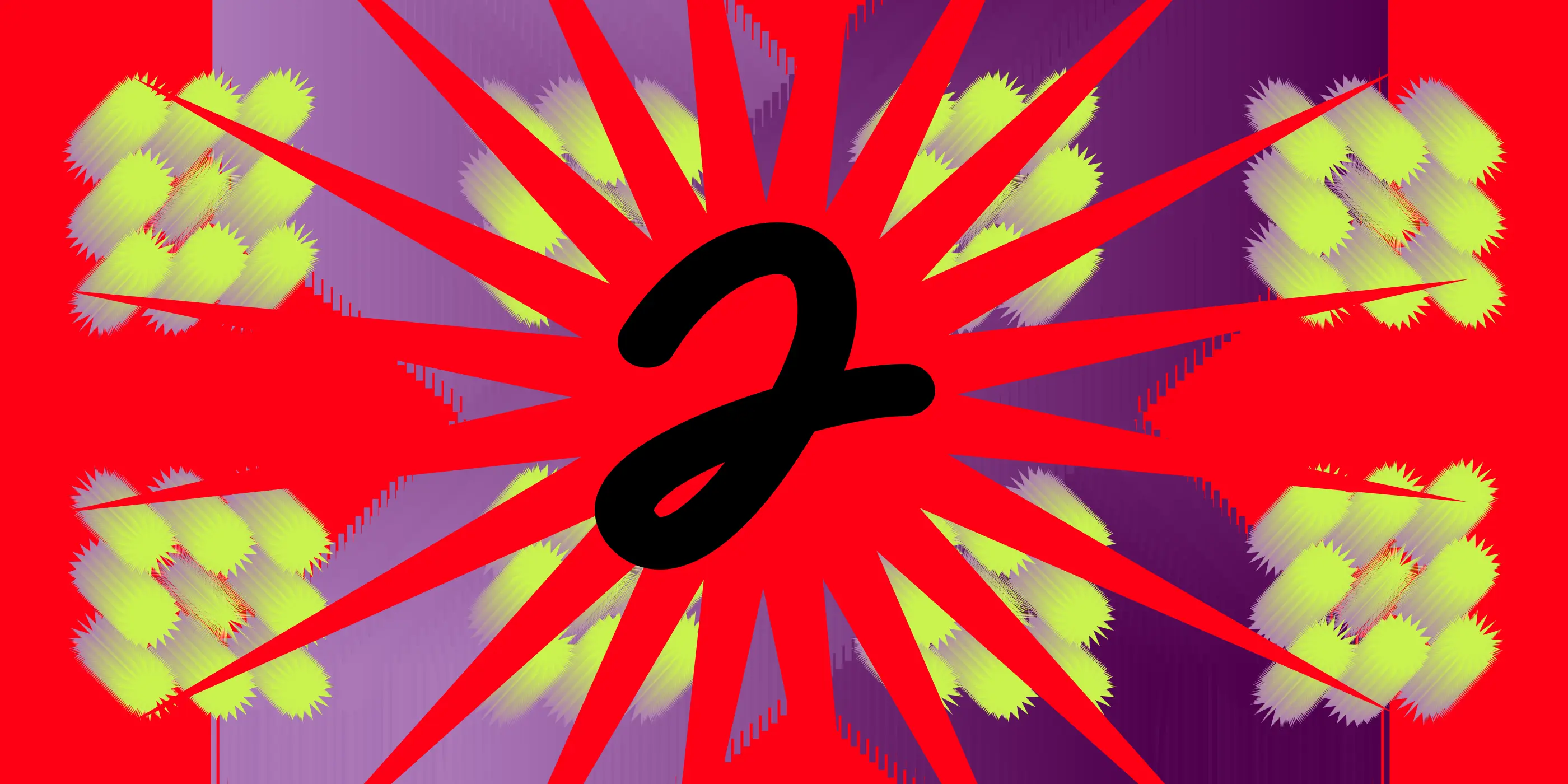
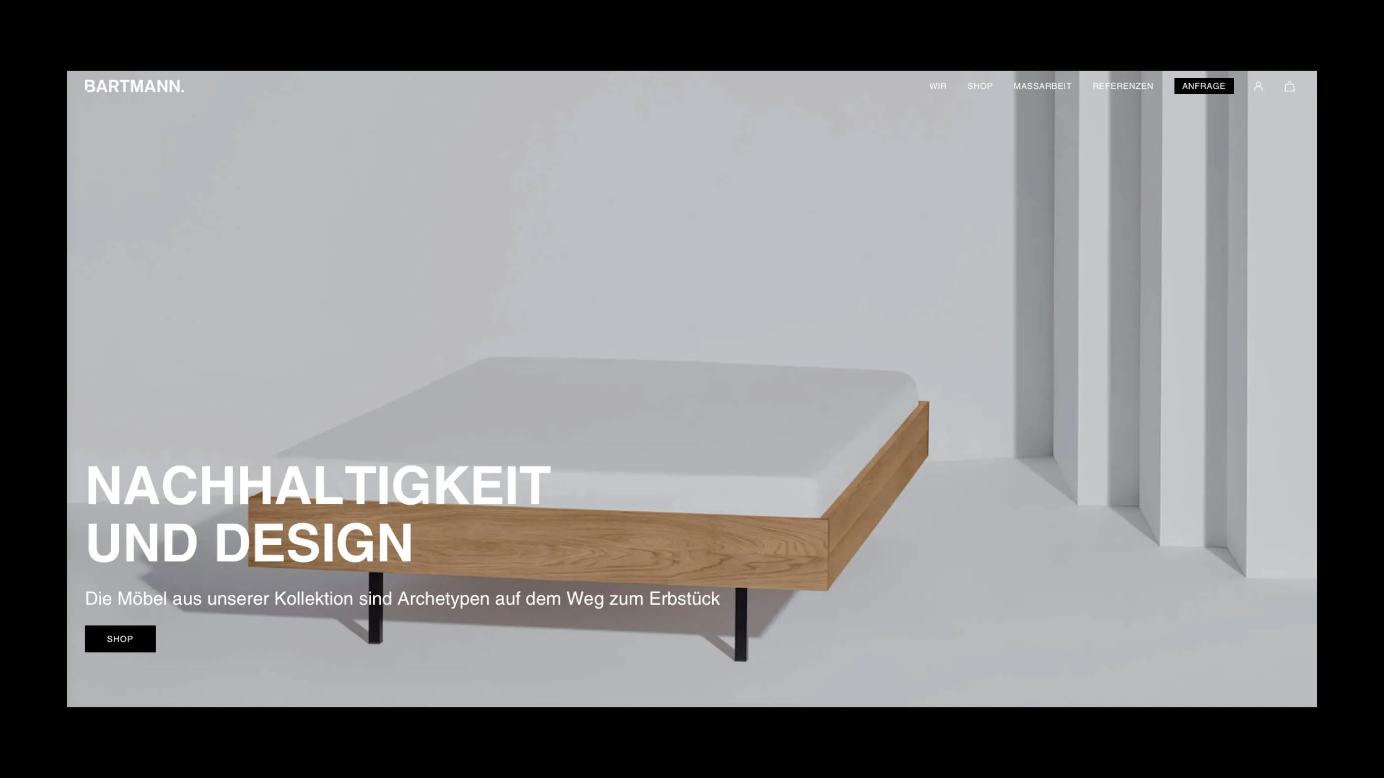
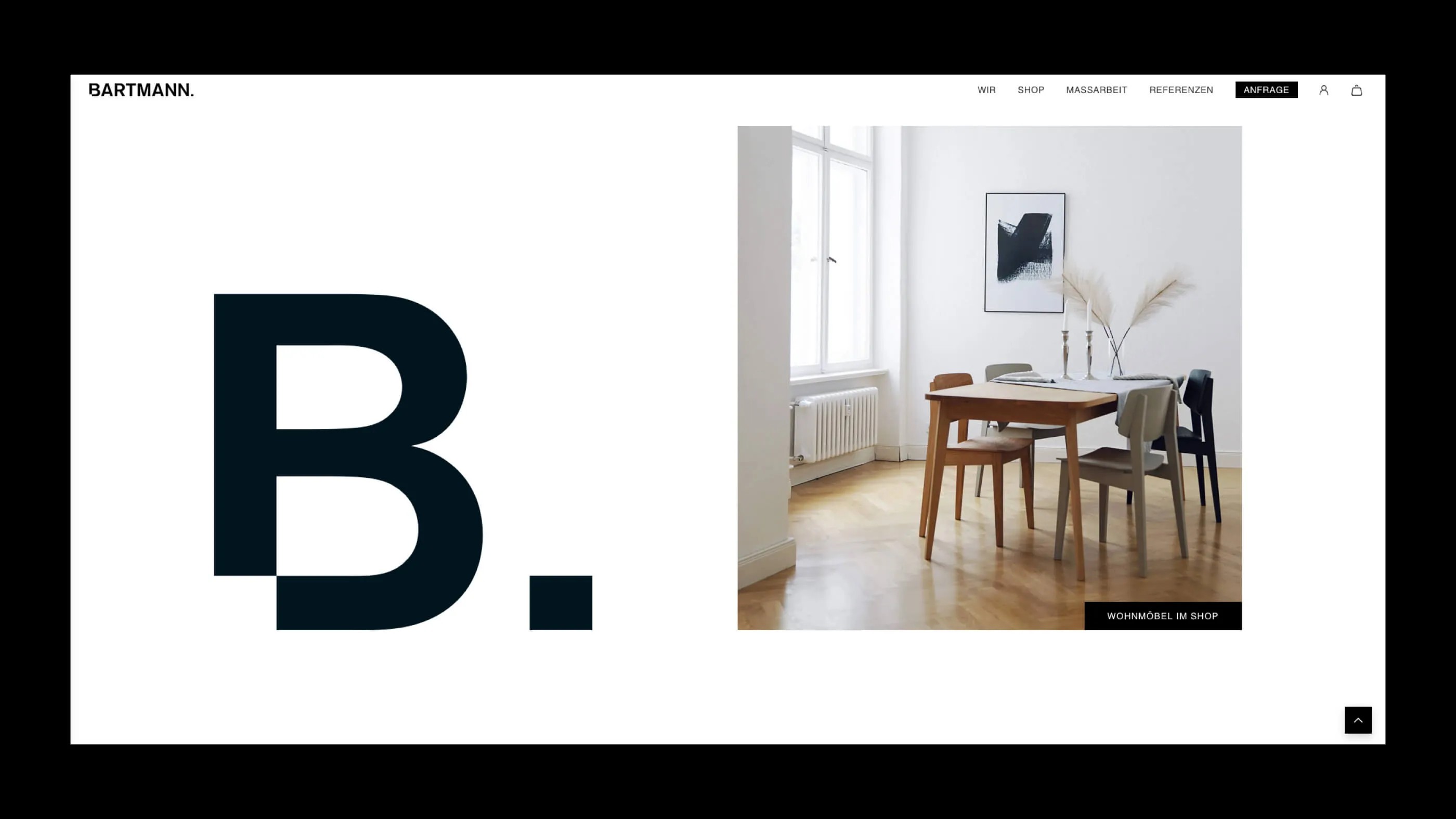
A dot as an exclamation mark
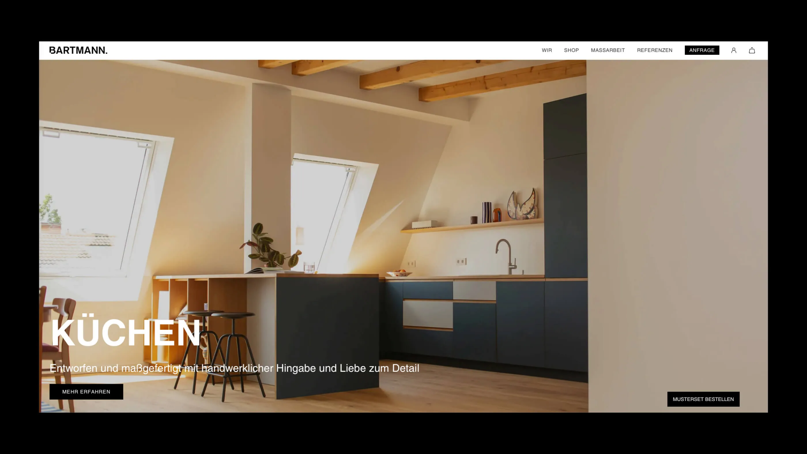
BARTMANN products are well on the way to becoming classics. We also wanted to give the brand image more self-confidence: new name, new logo, new website (technology).
We have a special history with BARTMANN. Before the company moved its workshop to Tempelhof for space reasons, they were located in the direct neighborhood of our office on the border between Kreuzberg and Neukölln. Back then (probably more than 10 years ago), we were looking for carpenters who could make us special desk tops with linoleum surfaces - and we found what we were looking for. Many years later, they found us to revamp their brand and website.
BARTMANN has been around since 2007, but its appearance remained unchanged for a long time. After a process of reflection on the vision and mission of the company, we not only decided on a new brand design, but also adapted the name at the same time. bartmann berlin became BARTMANN, because the brand has long since grown up and the name no longer needs the addition of Berlin.
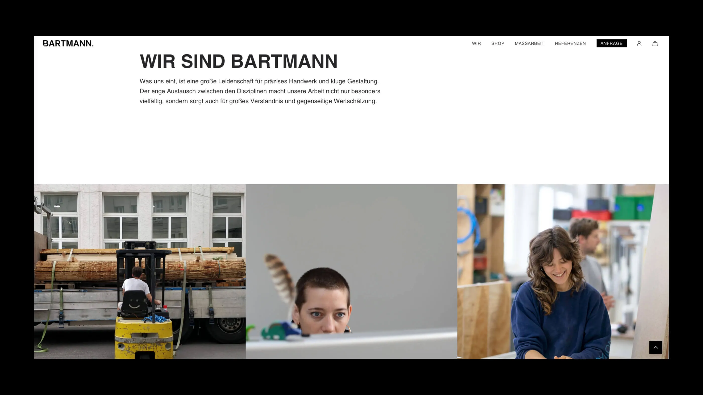
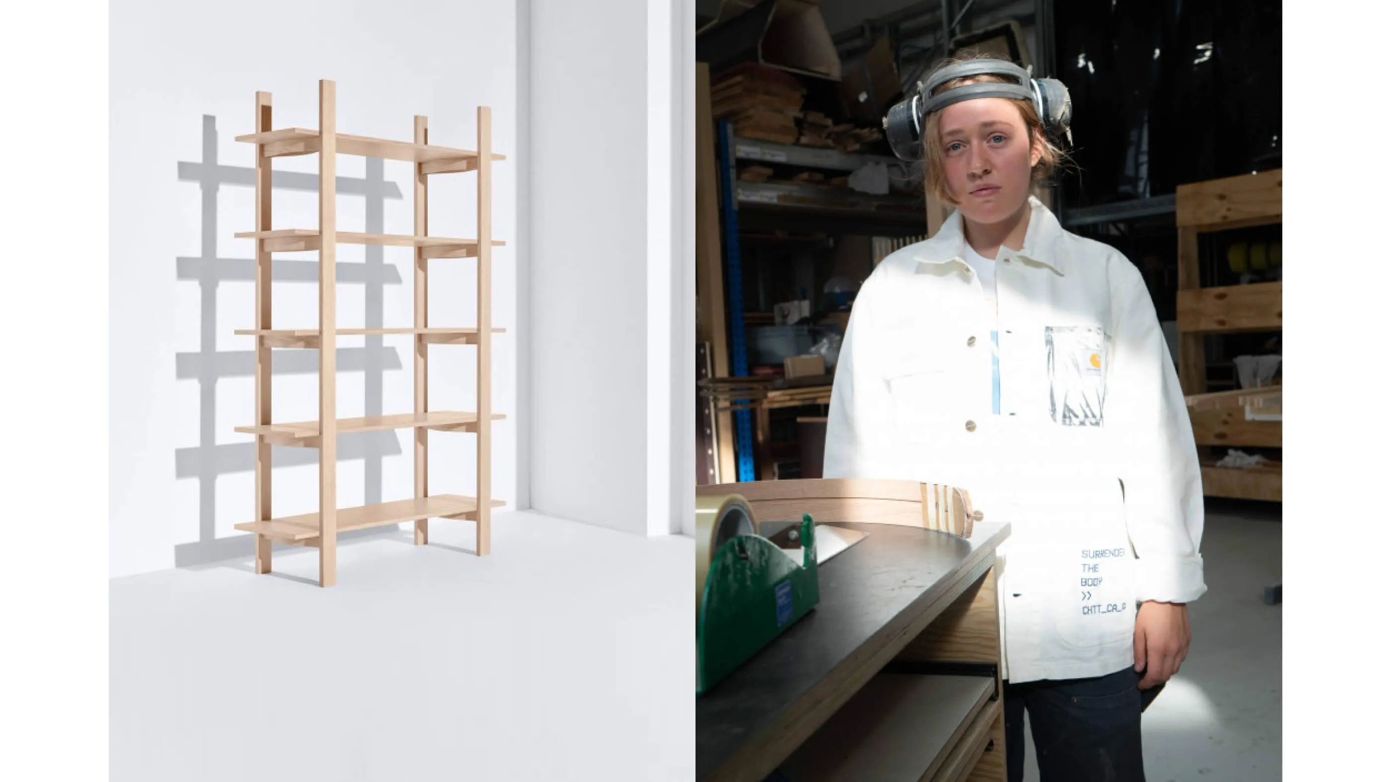
BARTMANN therefore makes a point that resembles an exclamation mark. This point is also reflected in the logo. It is solid, robust and yet special. It symbolizes the tension between opposites at BARTMANN: products such as chairs, tables, kitchens and beds are manufactured by hand in series, but at the same time the carpenters from Berlin-Tempelhof also take on completely individual orders for wardrobes, kitchens, entire interior fittings, etc. - professionally, but also approachable and personal. It's all about details, design, sustainability and always the people behind the product and those who use it.
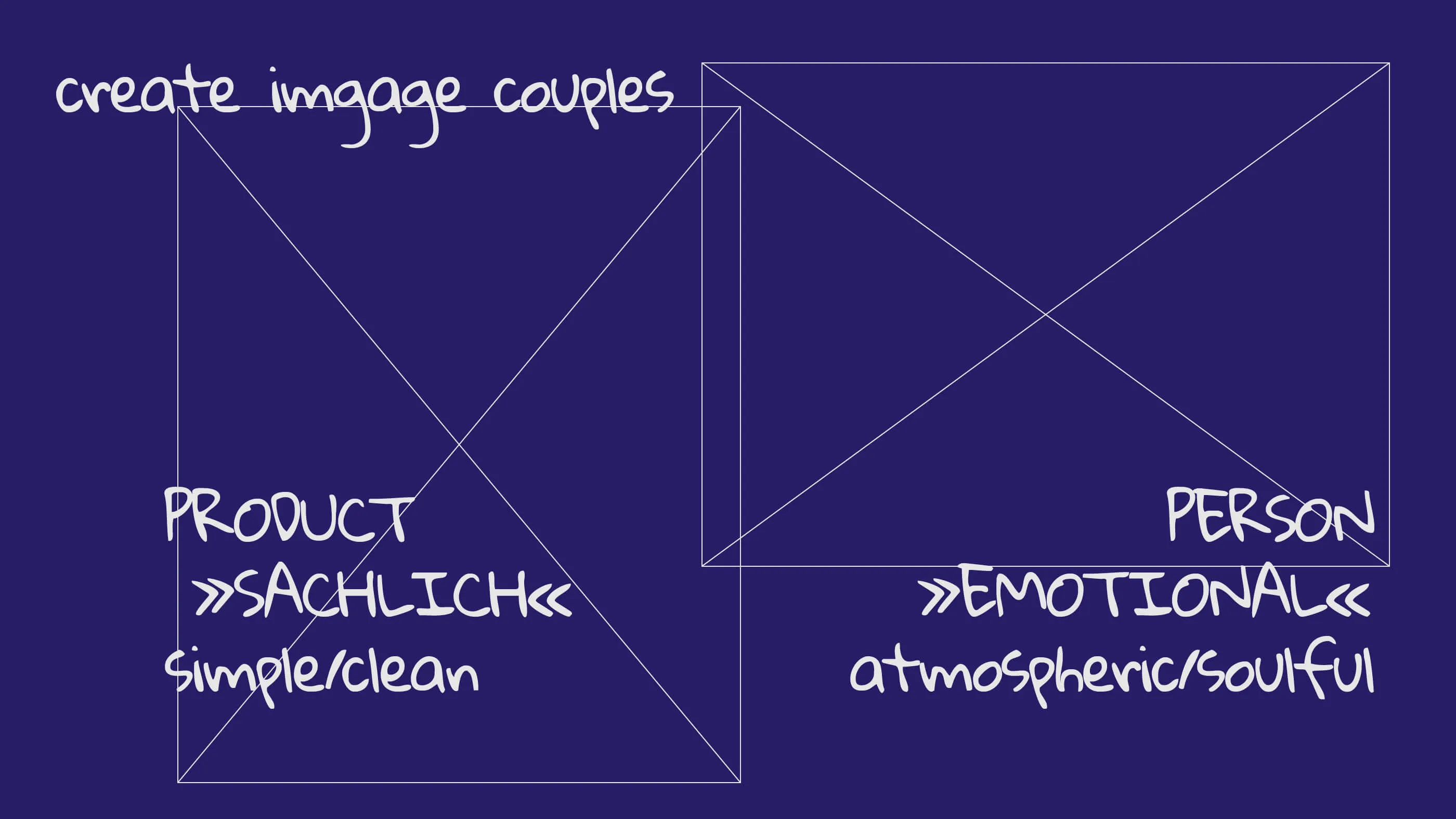
Our image concept also reflects this. It combines classic objectivity with emotionality.
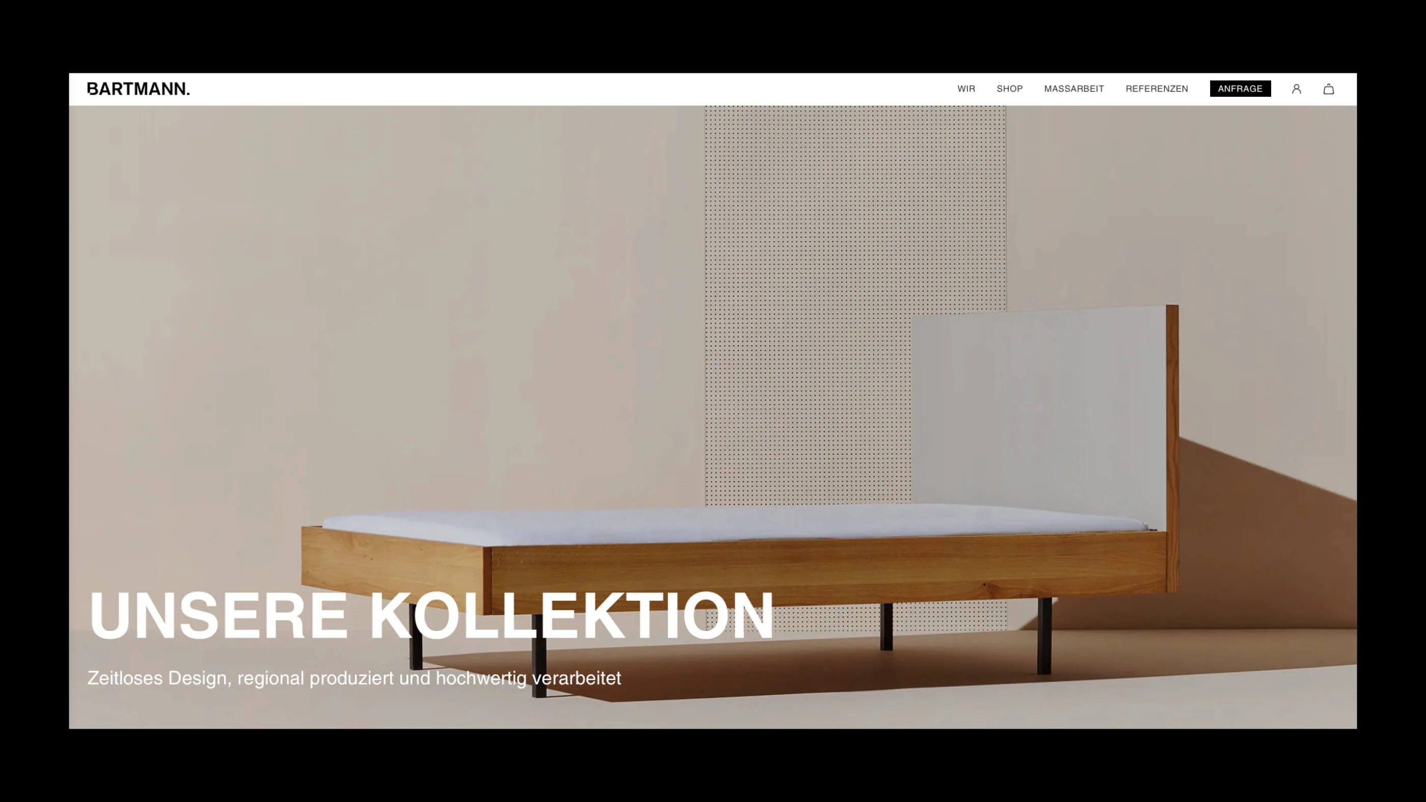
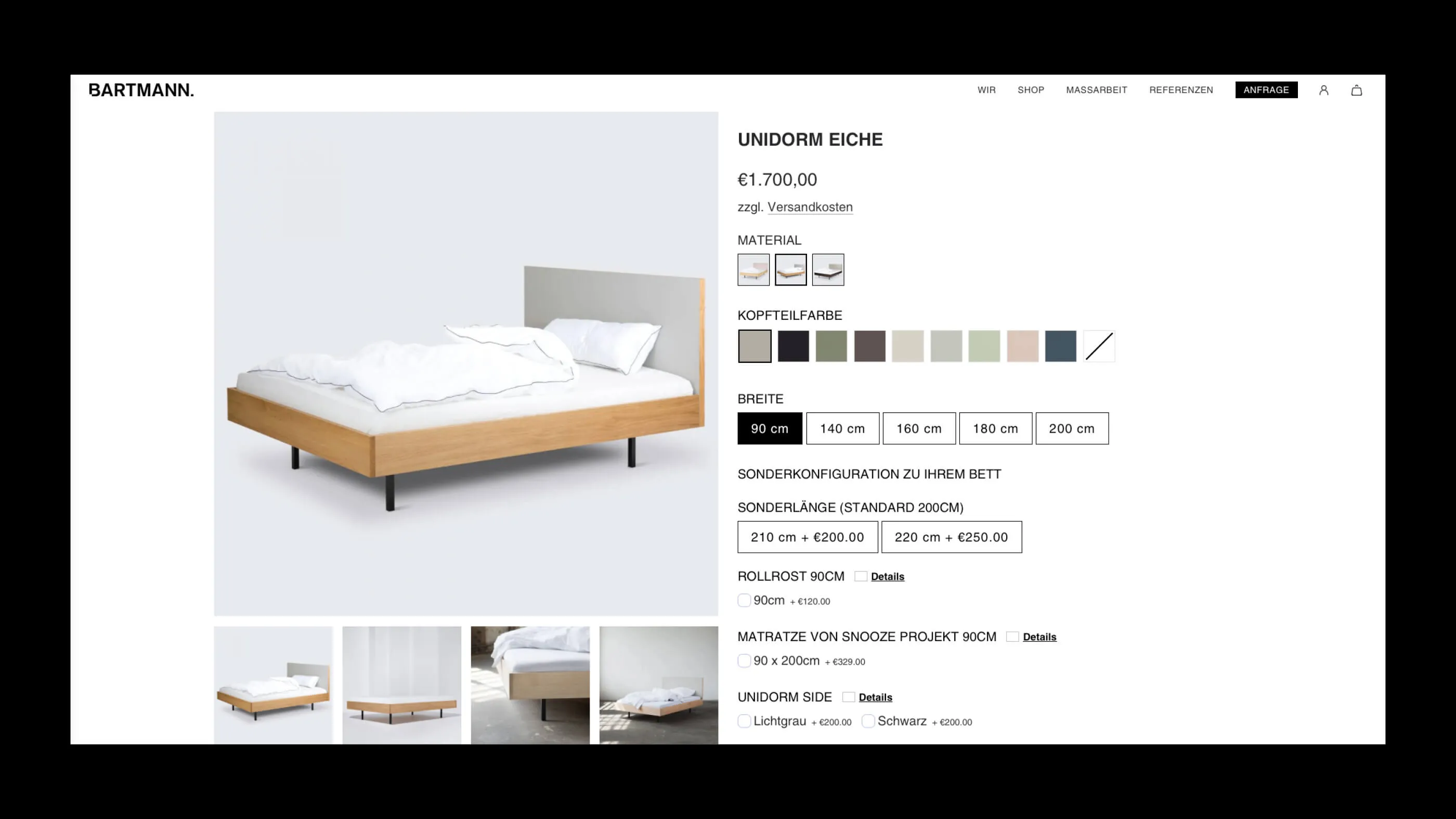
We also implemented a website project in Shopify for the first time, in collaboration with the Kombinat agency. In the process, we got to know the advantages and disadvantages of the platform. Of course, Shopify is all about the store part. Not so easy for a site that should also have many narrative moments, far beyond "Buy now".
Nothing works without themes, also new territory for us. Designer's honor! And the (always necessary) adjustments to such a theme also require designers to be willing to compromise. But with a little hand-inserted code, a good result can be achieved here too.
Overall, the experience with Shopify was an enrichment for our portfolio. But above all, we don't want to miss the collaboration with the great team at BARTMANN and hope that this was just the start of a continuous joint development.
PS: It's always nice and special when we can identify with our customers' products. Because yes, we also have a piece of BARTMANN in the office and can recommend the individual work just as highly as the products.