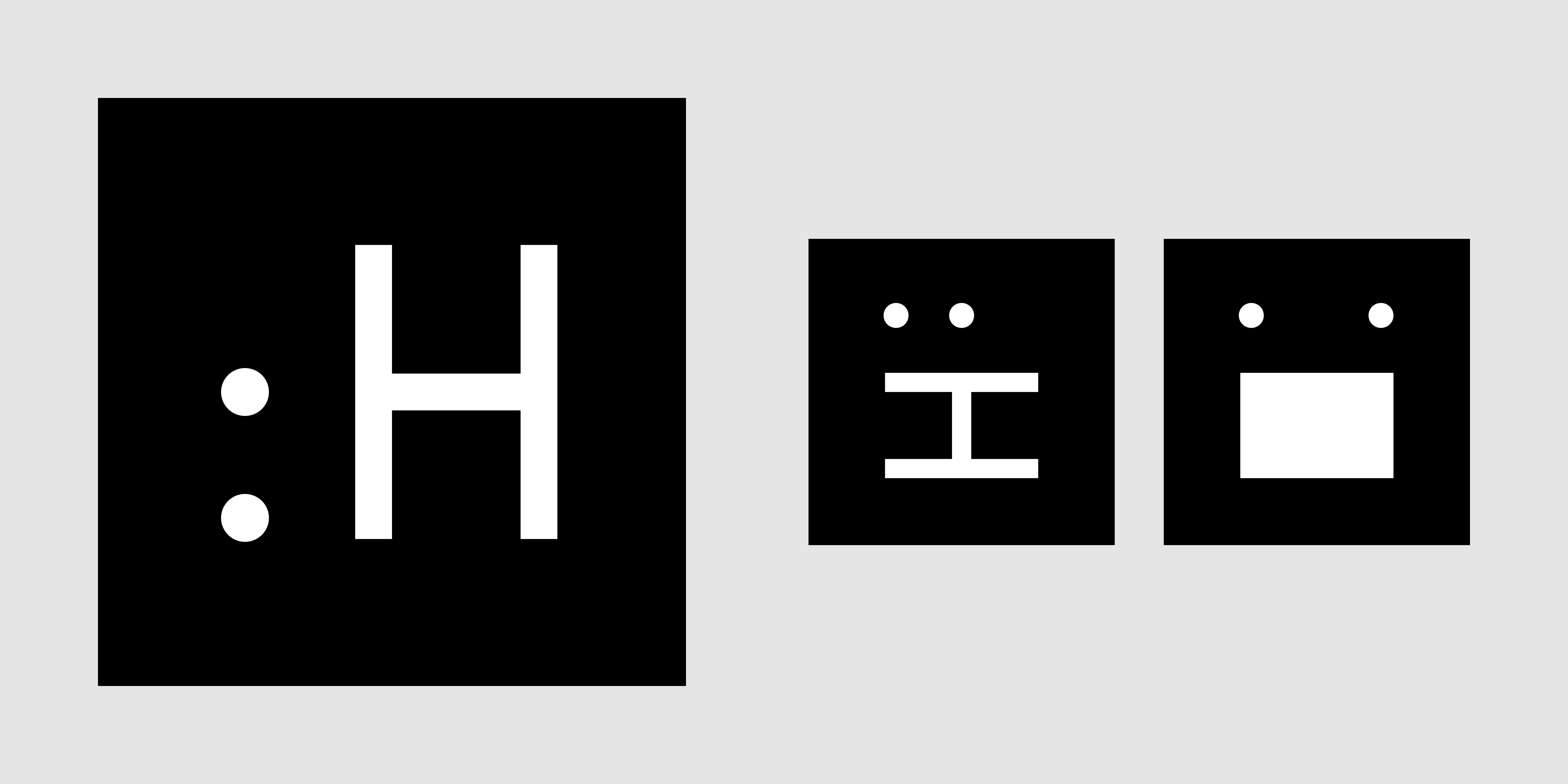
Make a colon
It is an unwritten law to never develop your own corporate design by yourself. Nevertheless, we have done so.
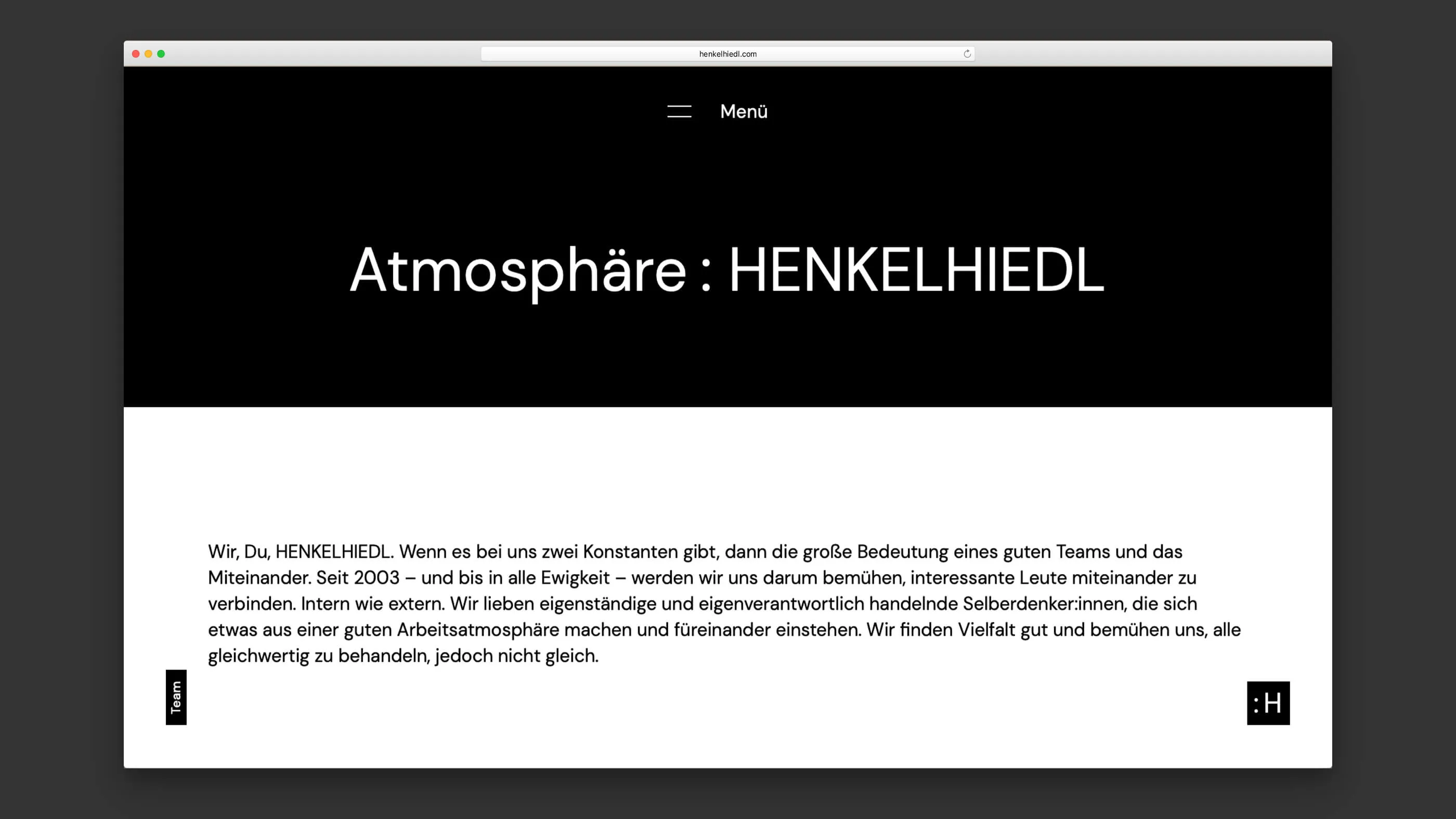
Ambition, humour and aesthetics: with our new image we want to stand out in style and convince in a contemporary way. A visual welcome for all of our colleagues. Unifying diversity in the world of collaborative, location-independent work. An expression of new beginnings in turbulent times.
Our corporate design should please without losing its core sovereignty and generally make many things possible. We want to be playful with it. It should express style and joy, lightness and seriousness in equal measure – just as we are.
It was also important for us to adapt to the almost exclusively digital environments in our daily work. Just like openness and flexibility towards all the changes and expansions that will be coming to our office in the coming months and years – because we have a lot planned.
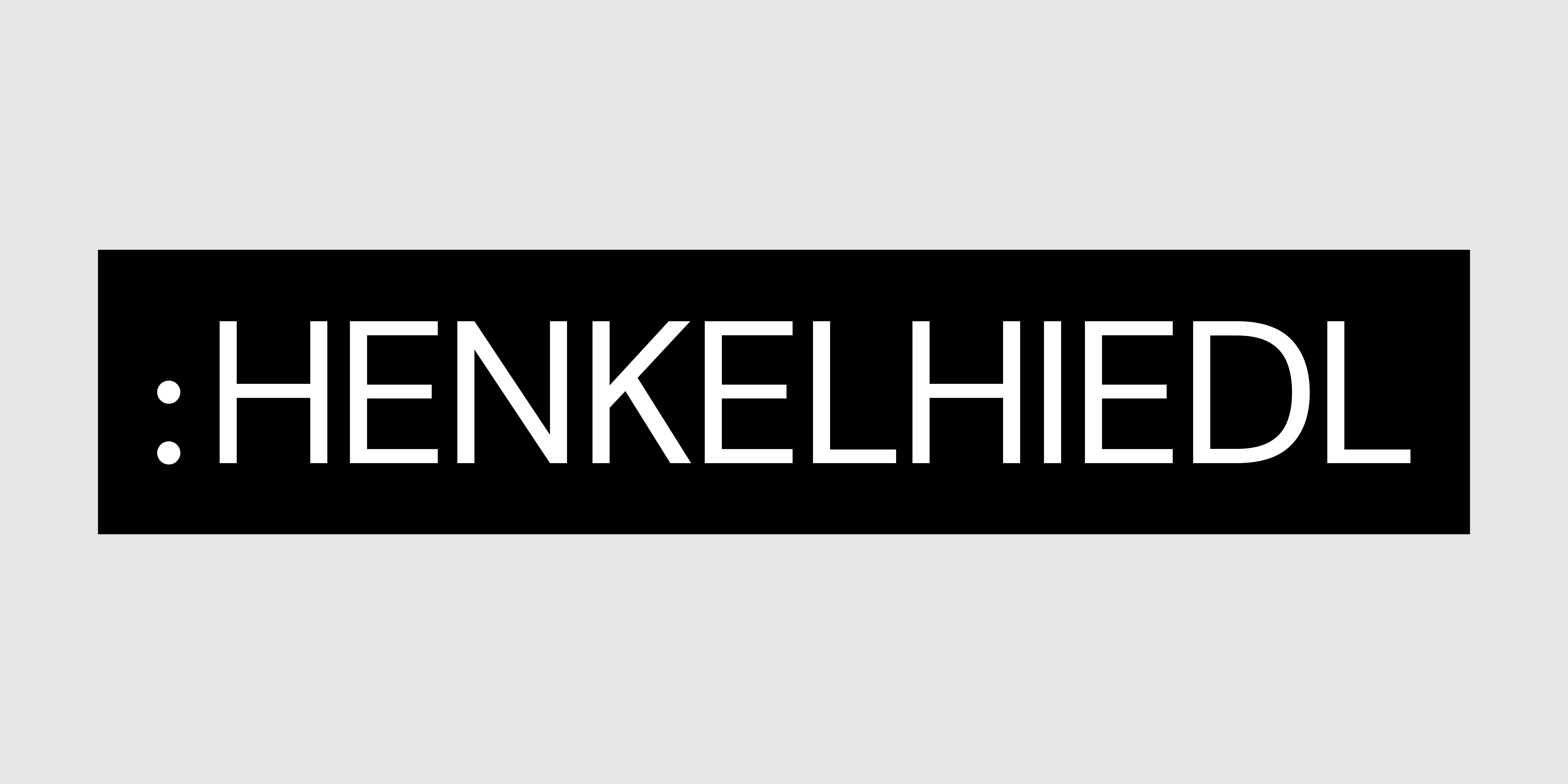
Our Logo/Sign: »Colon-H-Square«
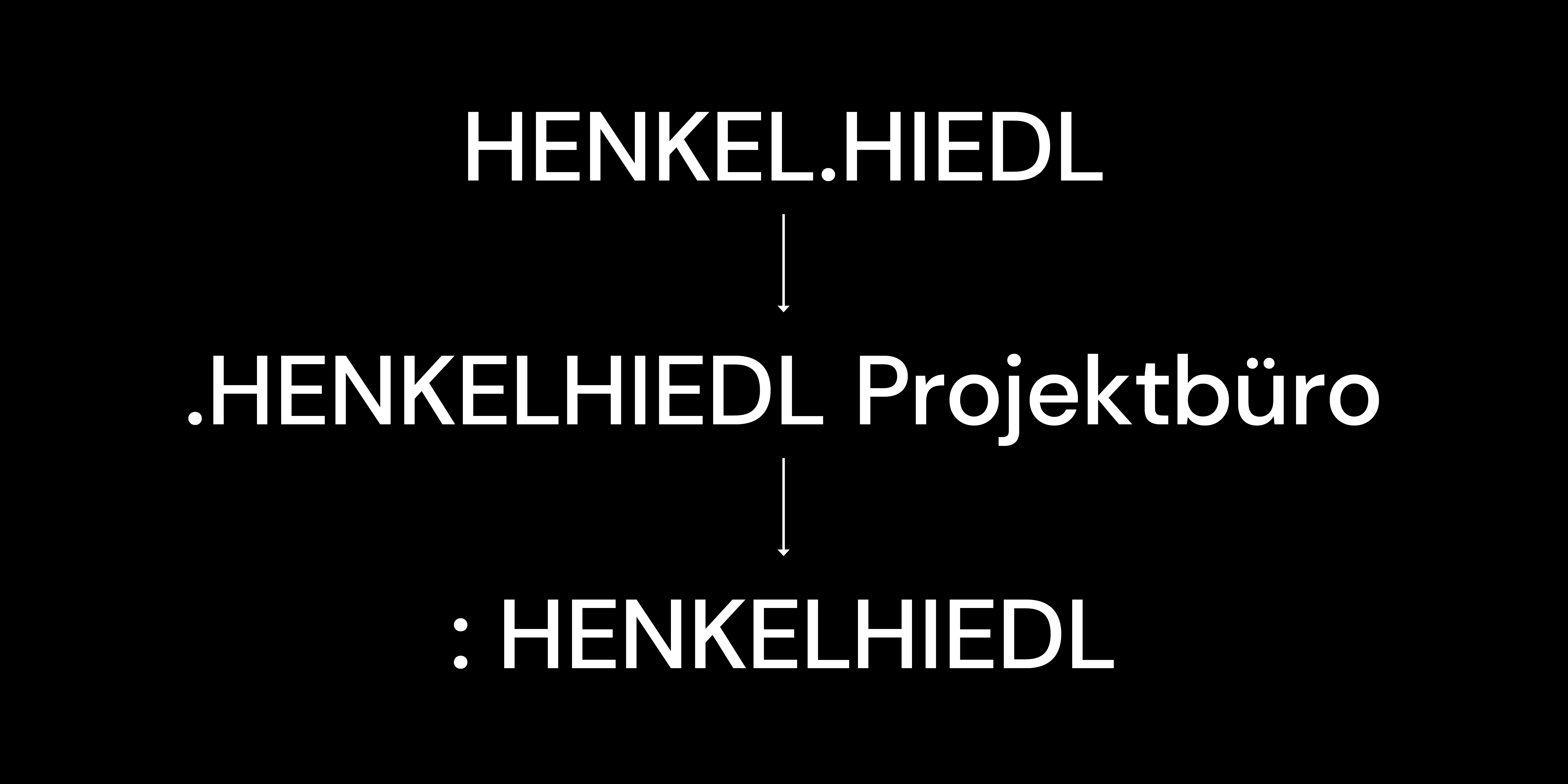
That was when the office was in its infancy: two designers (Bärbl Hiedl and Andreas Henkel) founded a joint venture. They give it their own name: »HENKEL.HIEDL«. And at some point (although never officially) they addede the words »PROJEKTBÜRO« (»project office«) to the word mark.
That was when puberty came: These two designers wanted to have made their point (.) in the world over the years. They wanted to establish themselves. To prove themselves. Established themselves. Proved themselves. And projects became client relationships, which is why the »PROJEKTBÜRO was put on the back burner. The dot moved to the front, like a file extension (.jpg, .gif): ».HENKELHIEDL Projektbüro«
That will, if being grown up doesn't mean the end: These two are now one (yes: married!). Their entrepreneurial baby, the real one not yet, has been grown up for a while. It no longer only orients itself in the world, wants to be perceived in it, but actively co-determines it. Out of itself, as an institution, with an active speaking position. A new, old companion is coming along in 2019. The desire for a new design is germinating. So what to do? Two points. Because the office is now no longer run by the very close-knit duo, but by two equal people, with a little distance between them. Welcome Uwe Viehmann, in the team with Andreas Henkel. Hey colon. Hello »: HENKELHIEDL«
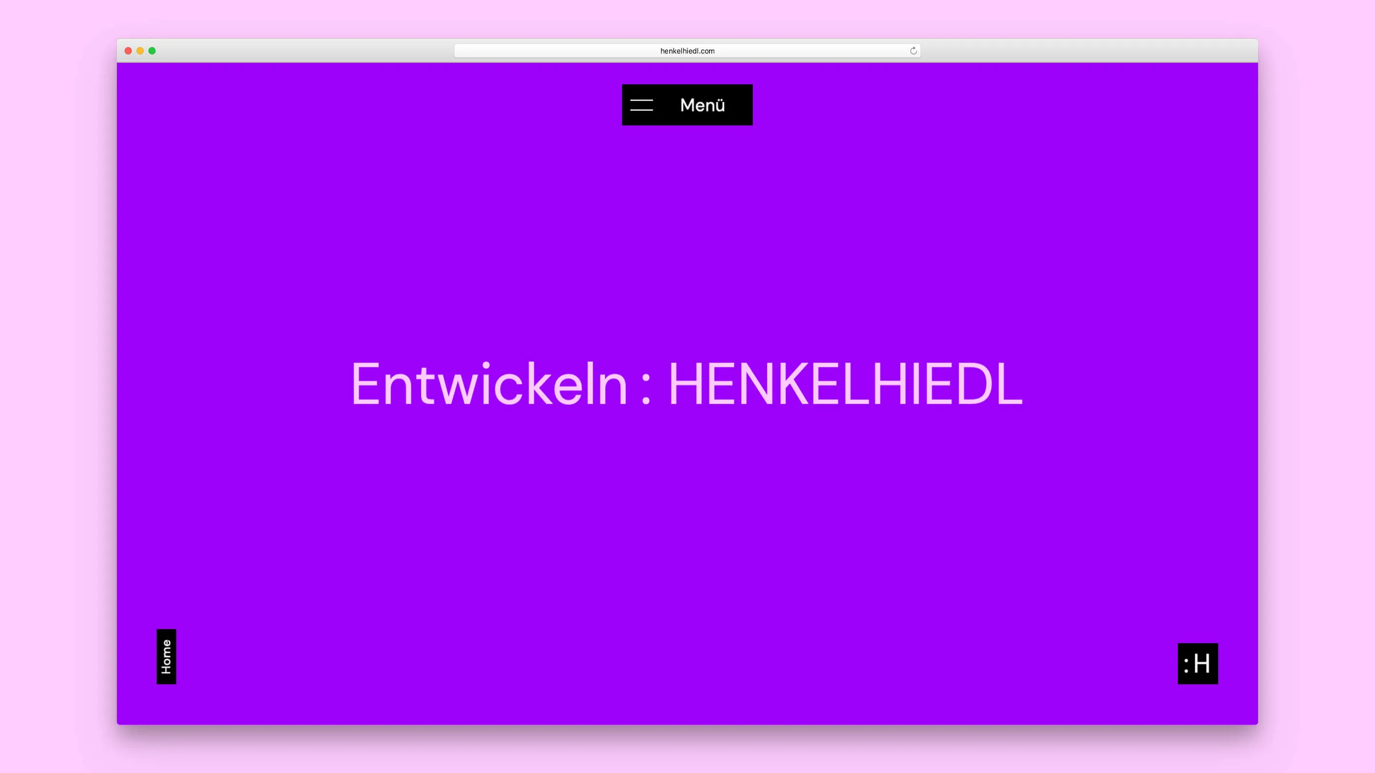
Yes, our logo is reminiscent of an emoji face. When you turn it, it takes on a certain expression. We want to be creative with it, e.g. animate it or add other elements to build an emotional world. But our design always remains reduced and minimalist!
Our Writing
The new house font is the sans-serif grotesque »DM Sans« from the Colophon Foundry – and we source it via Google Fonts for the greatest possible flexibility in the digital environment. We work with this font in all off- and online applications. In special cases, e.g. in Miro boards or in email signatures, we use the system font »Courier New«.
Our Colour Language
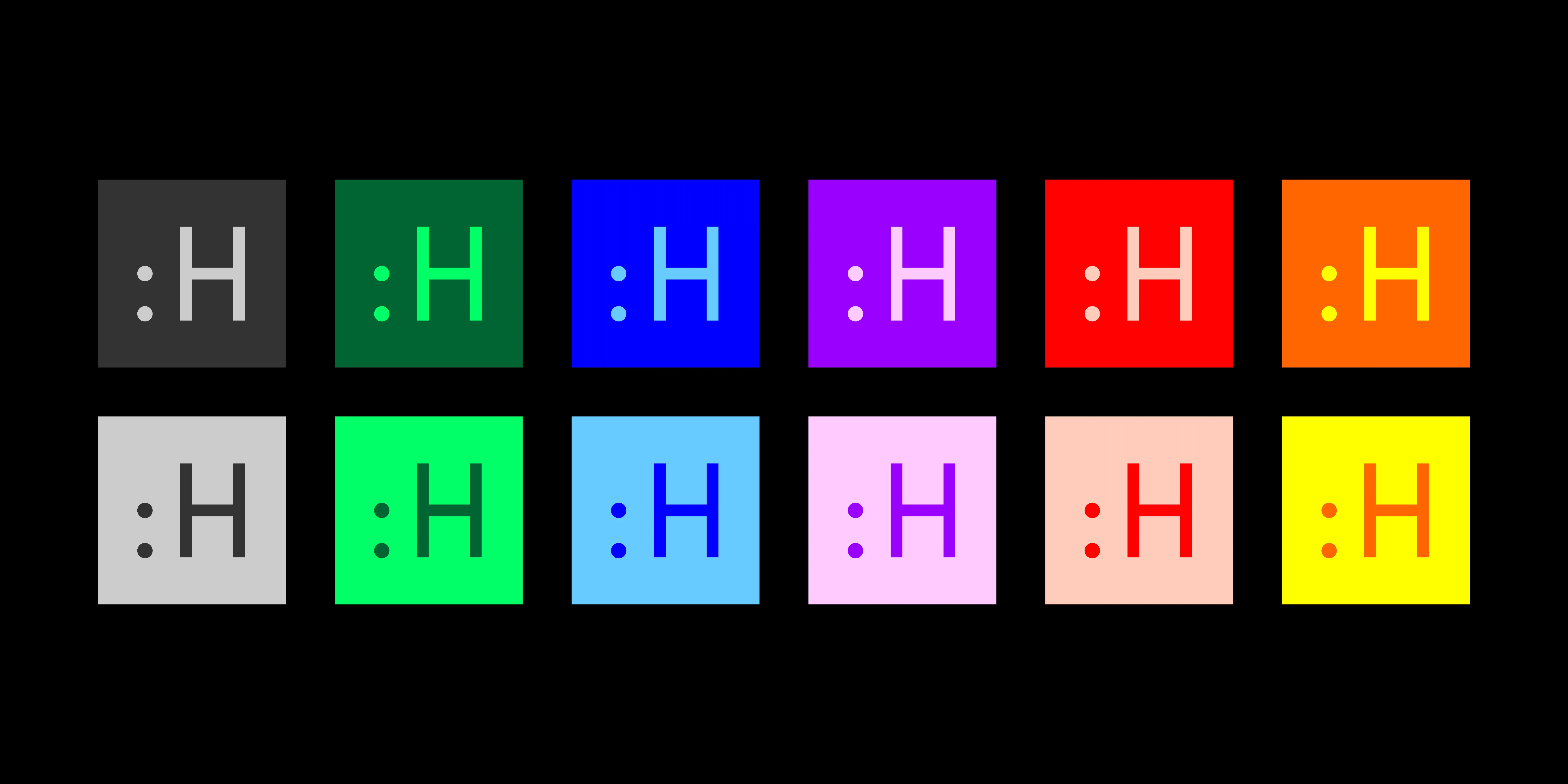
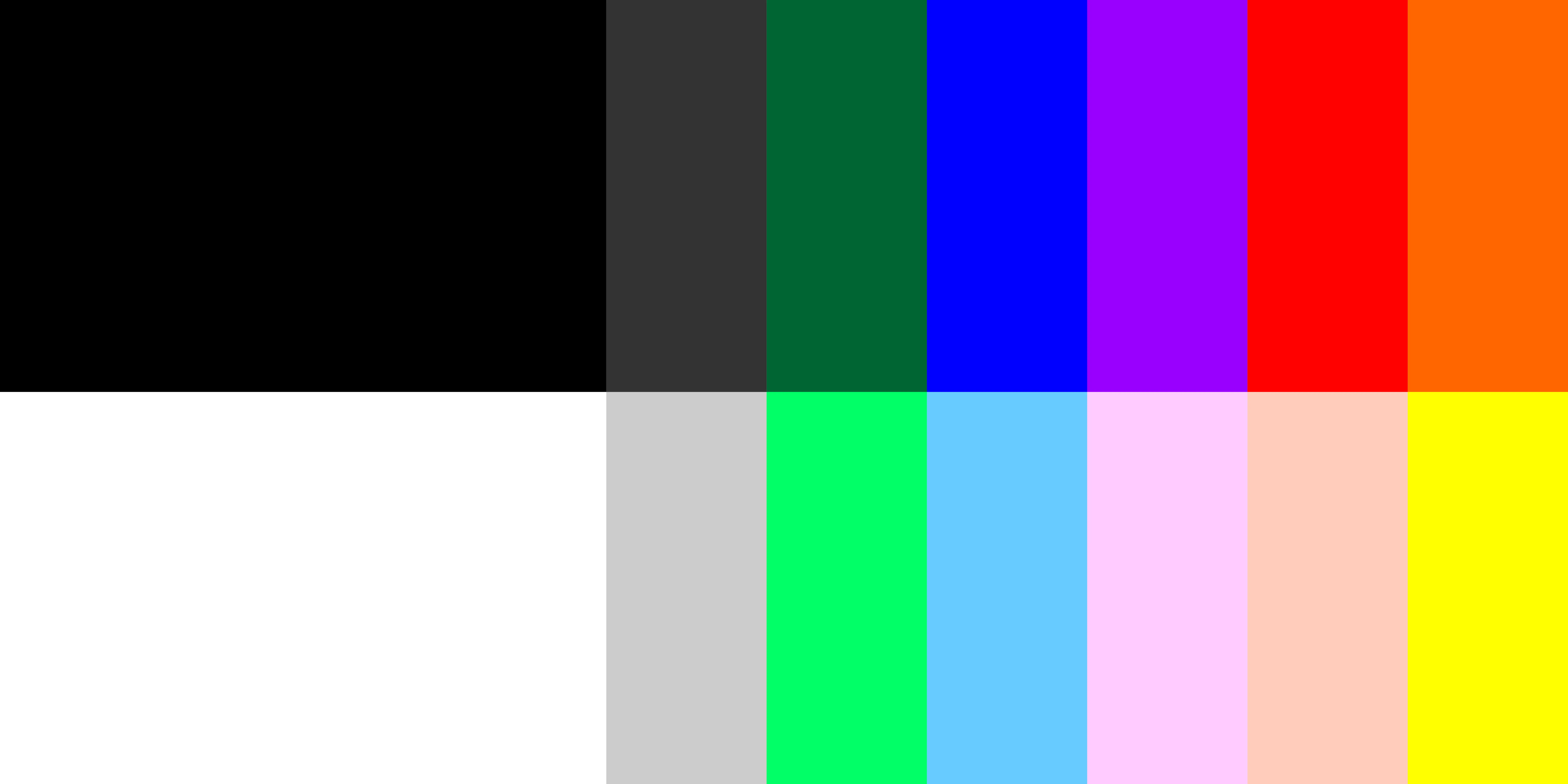
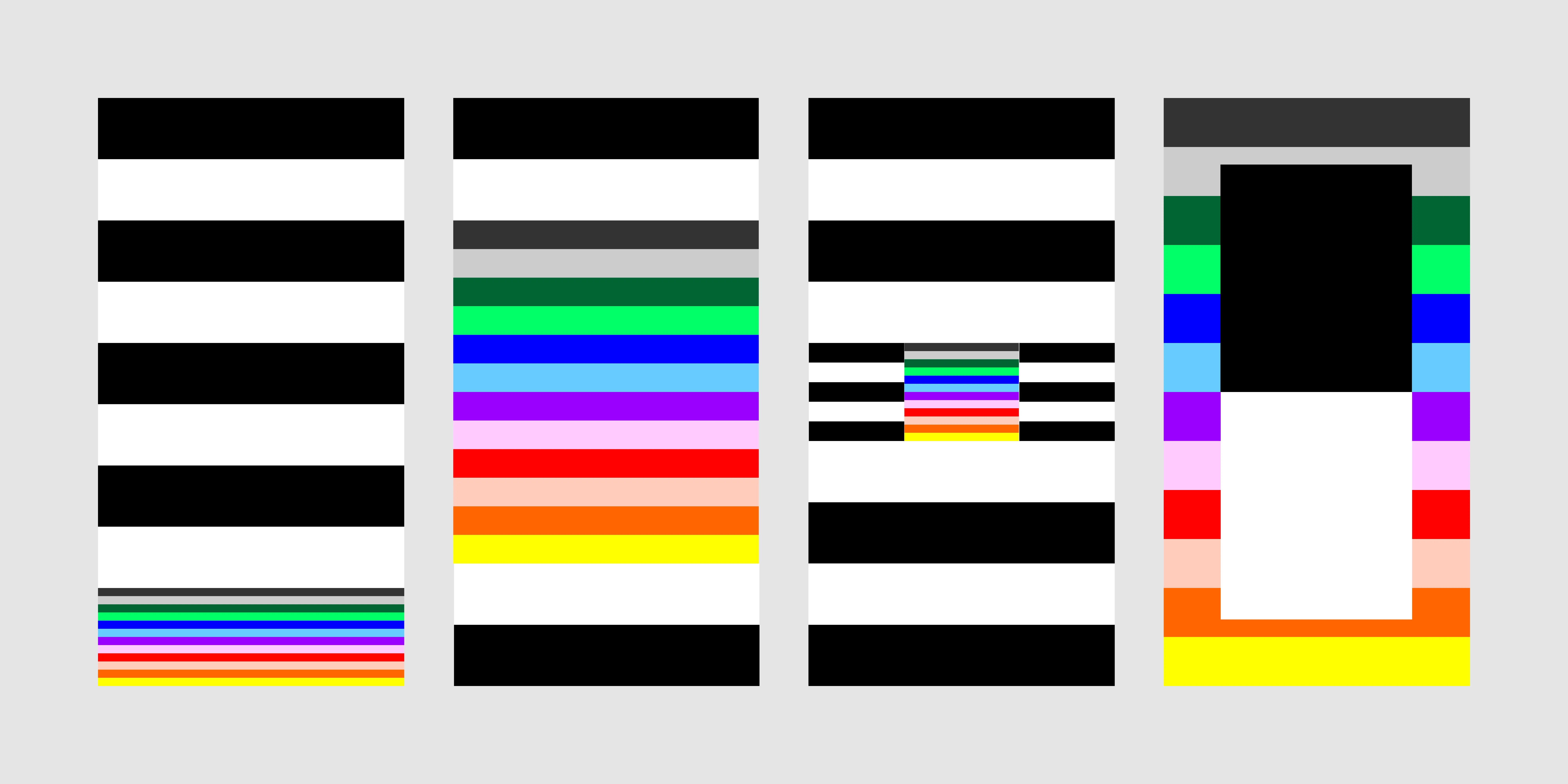
We also interpret our change with colours. We have formed six pairs xactually seven, not to mention black and white. We come into contact with the world in several places (also through design): through business correspondence, in the context of communication about ourselves, but also in the communication of our creation for clients – and last but not least through tools and other platforms that cannot be completely controlled, we call it: Playground.
These areas work together but behave differently:
- In correspondence, plain b/w predominates, colour is only a dabber.
- In the communication about us, b/w forms the beginning and the end, but in between we experiment completely freely with »our colours«.
- In communicating our creation to others, b/w forms the complete frame in which our work can work for others.
- In tools/the playground, we »shoot freely«, but in essence we ensure recognition with simple means.
Our Written Language
Colons are a great way to play as the website proves this in more than one place. Our word mark is »: HENKELHIEDL«. Only when used alone, like a logo, do we use the colon followed by a space. In longer texts, we also like to use the familiar term Projektbüro if the addition has been introduced at least once before with »Projektbüro HENKELHIEDL«. This is still not an official name. We never abbreviate »HH«. No one. Unless it means the number plates of the Hanseatic City of Hamburg or a report on the protection of the constitution is being written.
The linguistic gender equality we prefer can be achieved either by making it visible or by neutralising it. Not least thanks to our word mark, but also because in our opinion it is superior to the gender asterisk visually and in terms of accessibility, all staff (appropriately) use the gender colon.
Our We
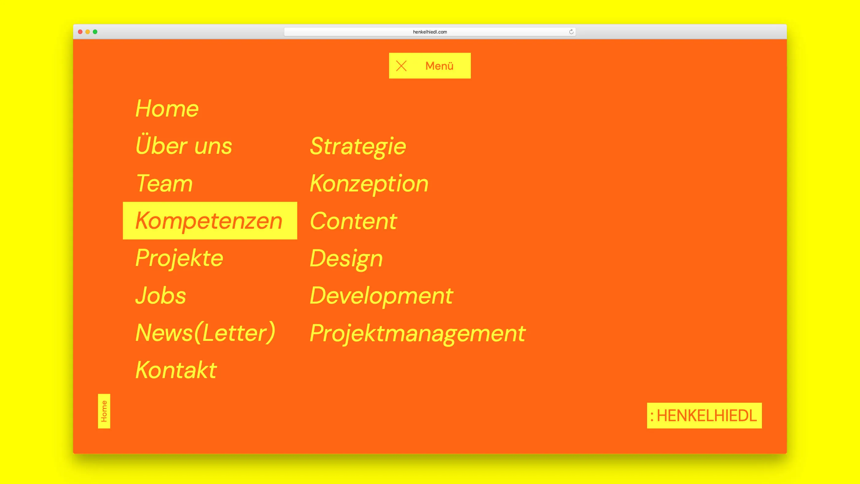
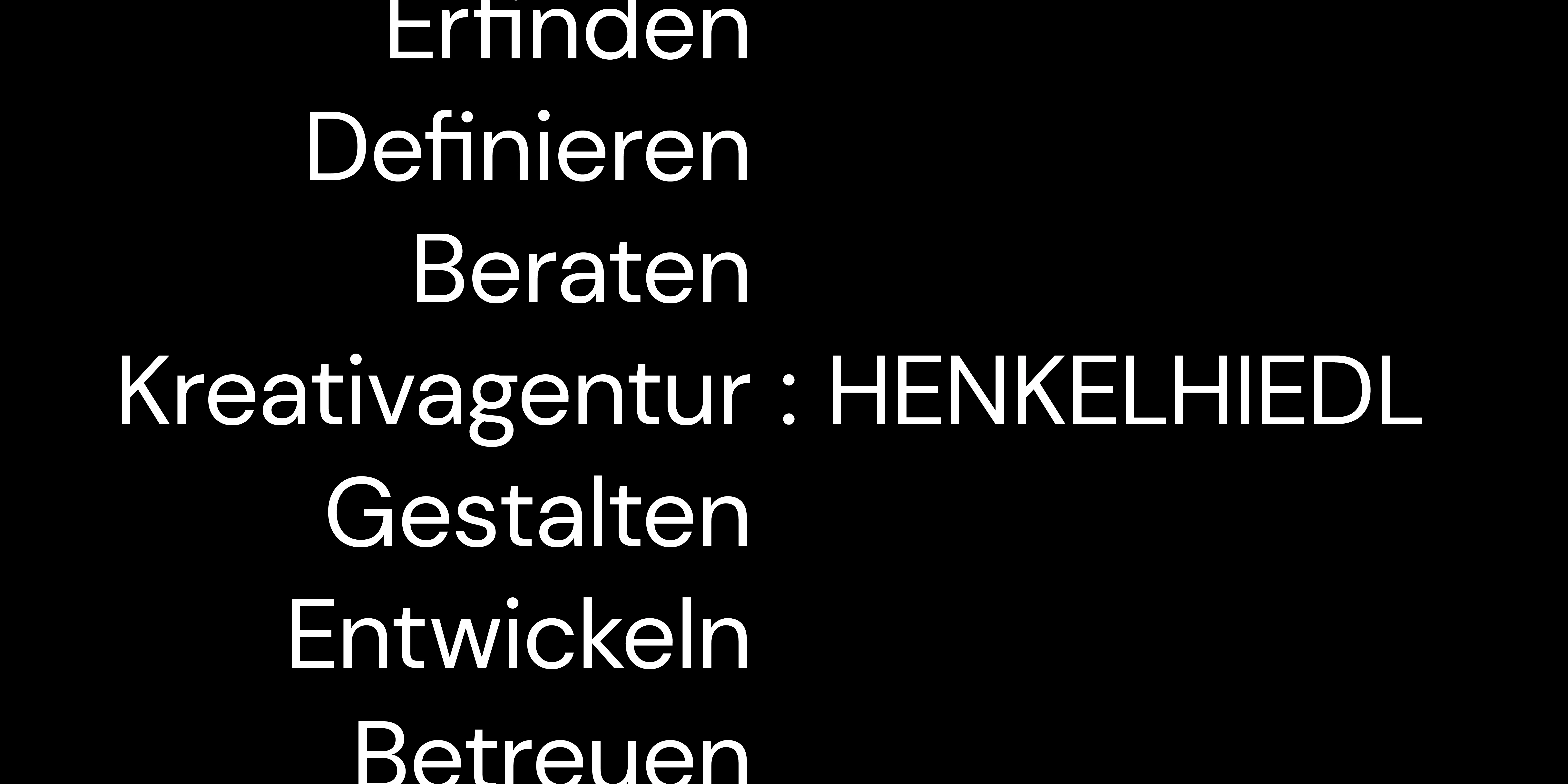
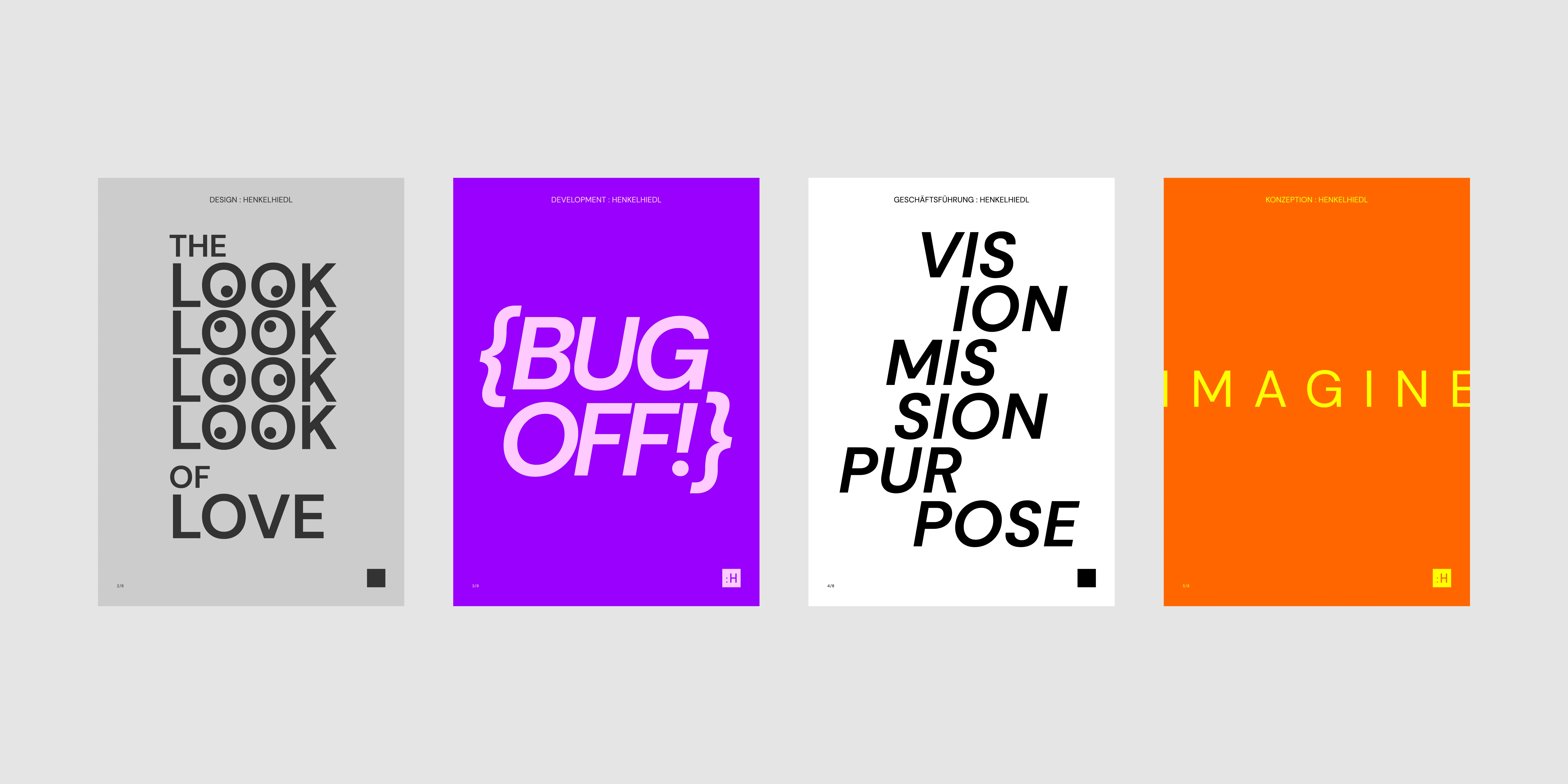
We are a diverse office, not only in terms of the nature of our staff, but also in terms of the technical disciplines we work in: Content, Design, Development, Management, Conception, Office Management, Project Management, Strategy. We wanted to honour them, we wanted to honour all of us, and so we designed posters for each craft. We will continue to develop them, the posters and the trades – we like them very much at every moment.


.jpg)