Themes, relaunch, experiments!
Design, system, features, UX - all new and modern at baunetzwissen.de, the online lexicon of the architecture magazine BauNetz
Baunetz Wissen is the free online encyclopedia of the architecture magazine BauNetz. A long-standing customer of ours, for whom we successfully relaunched the knowledge database formerly known as Infolines back in 2008. At the end of 2016, another modernization was on the agenda. They wanted a more modern, responsive look, new functionalities and an improved data structure. In short: an intelligent overhaul. No problem.
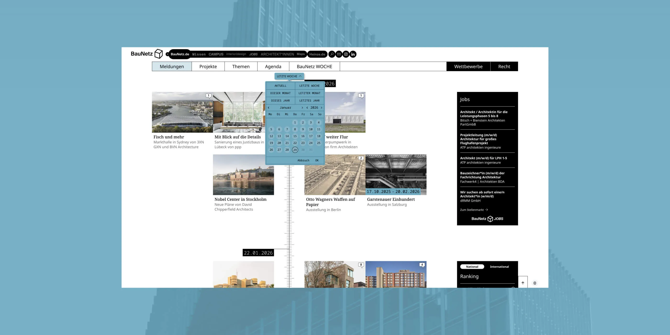
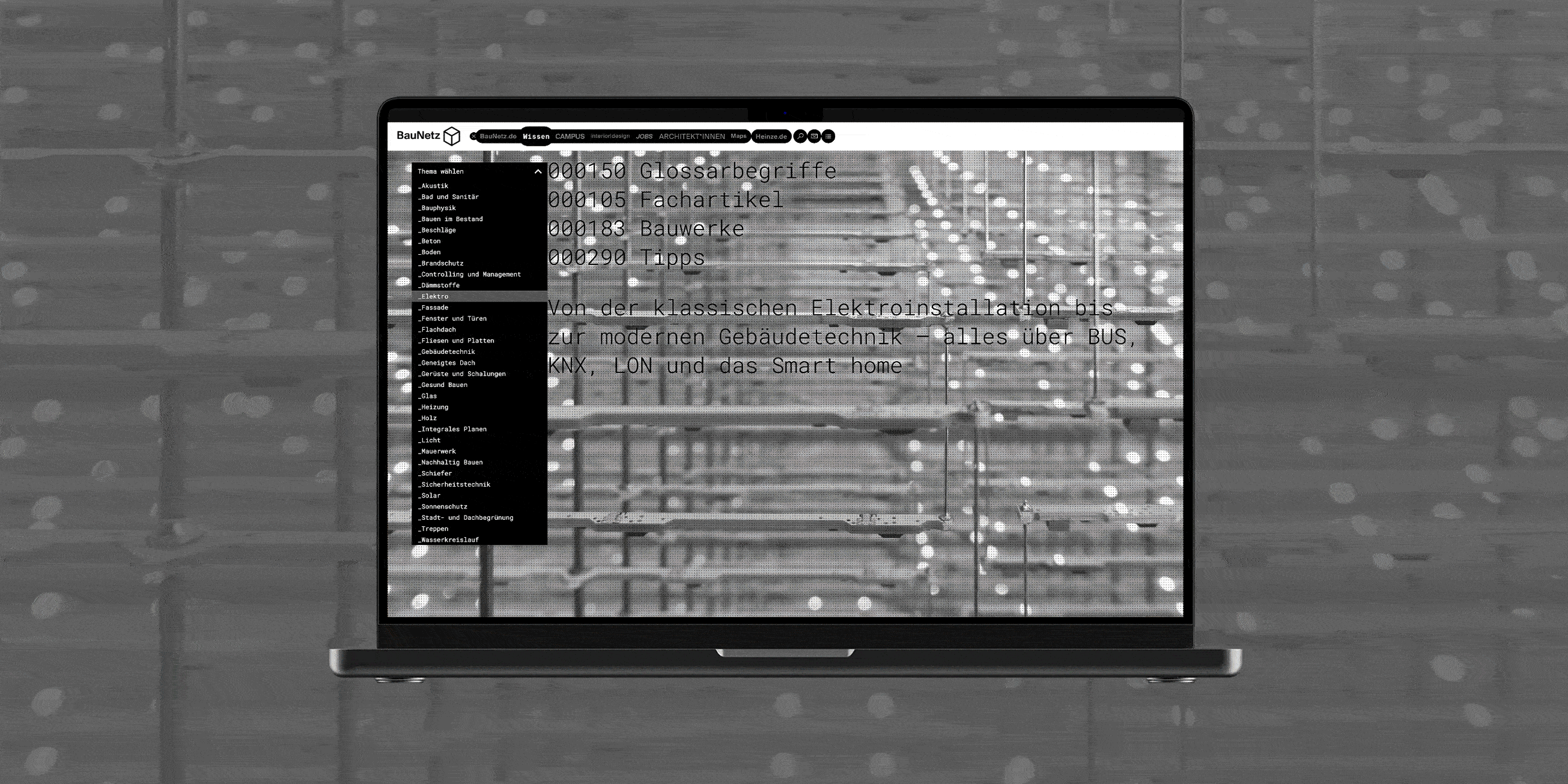
Start and topics
The new homepage flaunts (for good reasons, namely: rightly so!) the large number of articles and glossary terms in the system, visualizes them generously in facts and figures, but only ever shows a single article teaser. This means that the selection of one of the 27 subject areas is immediately in the foreground. If you move the mouse over the terms listed one below the other in the topic area on the start page, the background image changes and shows a preview of the contents of the topic pages.
Triad and navigation
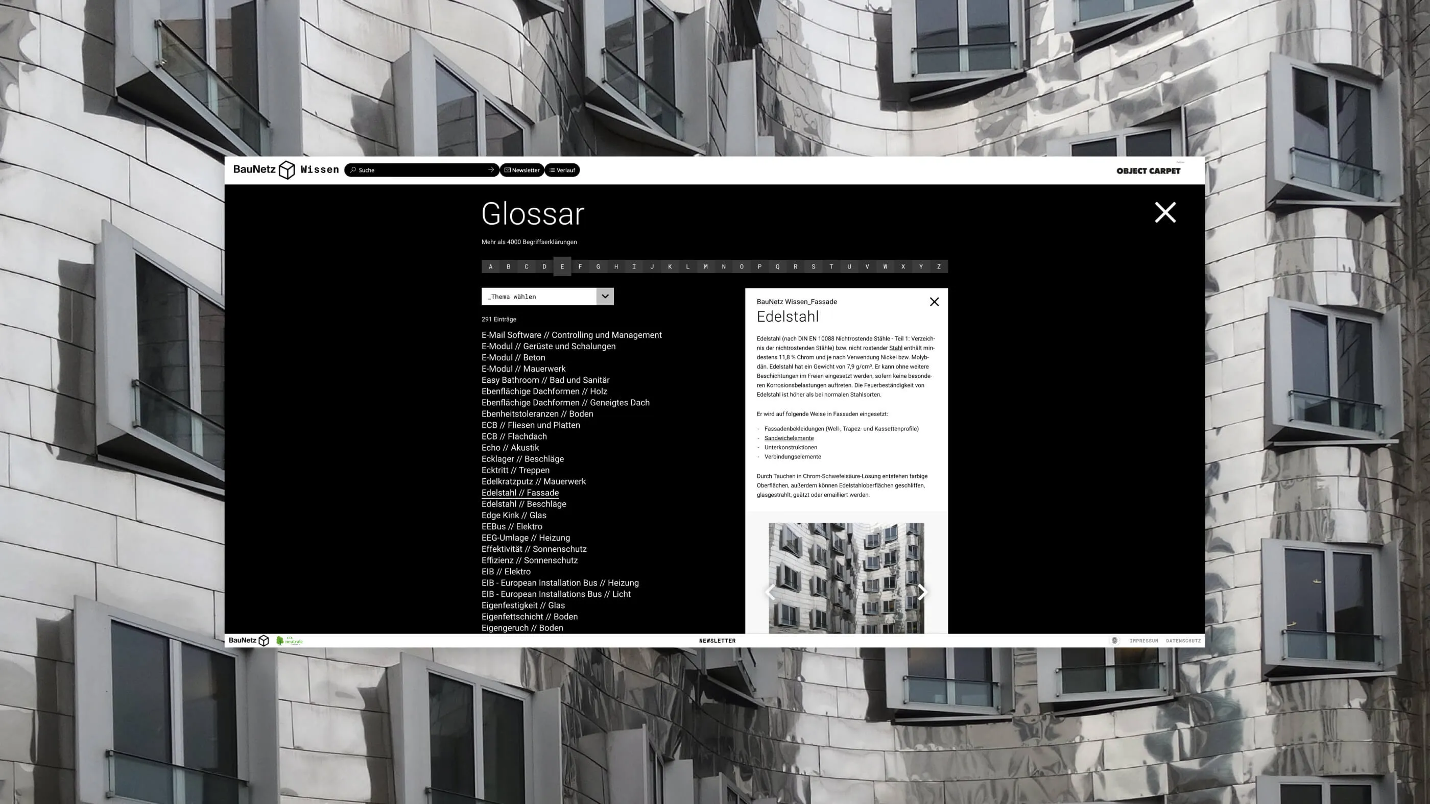
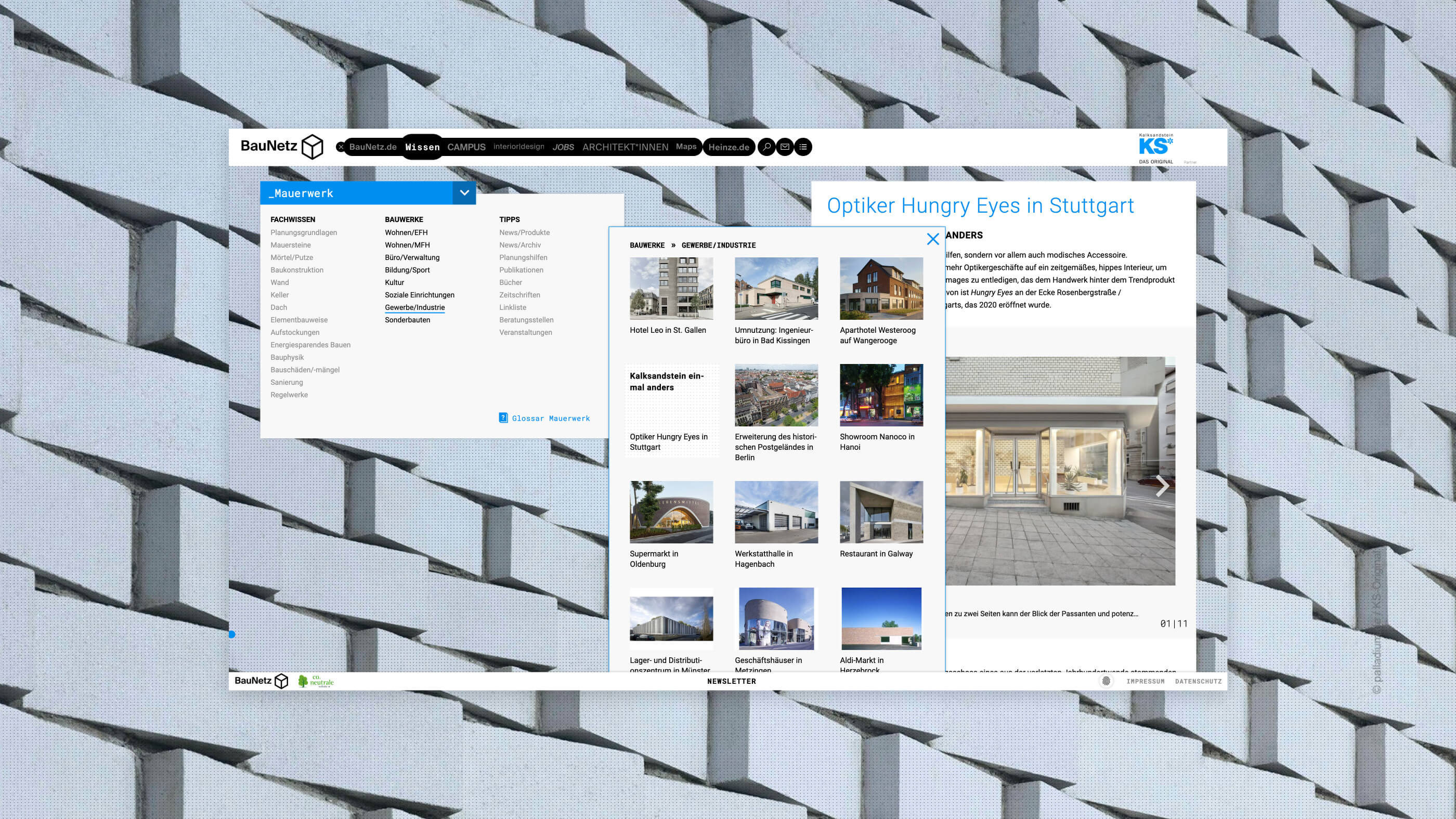
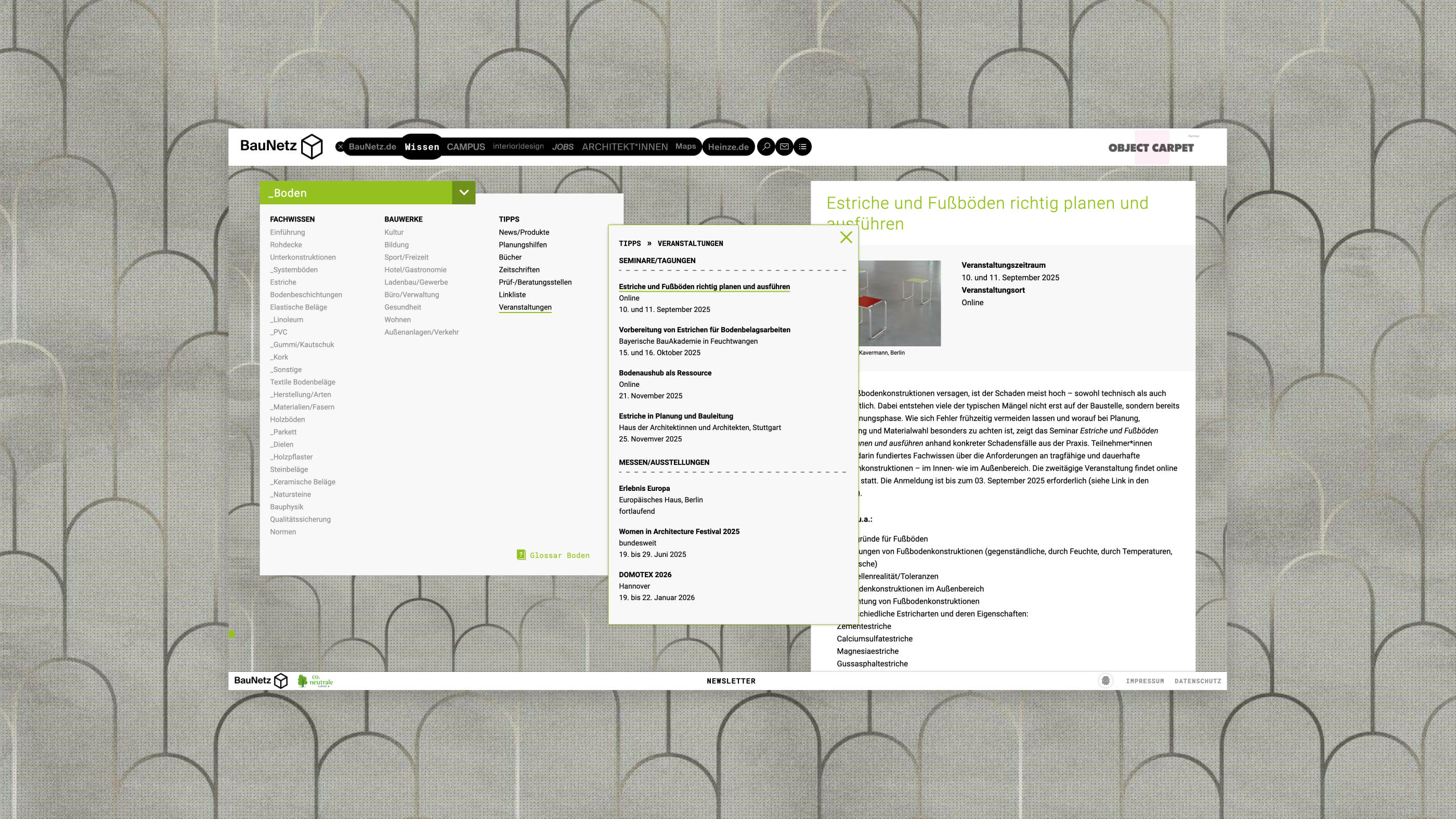
The tried and tested tripartite division into "Specialist knowledge", "Objects" and "Tips" in the subject area still forms the main structure into which each specialist topic can be split in terms of content. Individual articles can only be accessed at the third click level after a subsequent hit list. This is due to the conscientiousness and enormous scope of the database. We have therefore made important changes to the following navigation.
- Infinite scrolling at detail page level
- Consistent dynamic navigation by mouseover only saves one click level
- Double function of the theme selection: Theme home and theme change
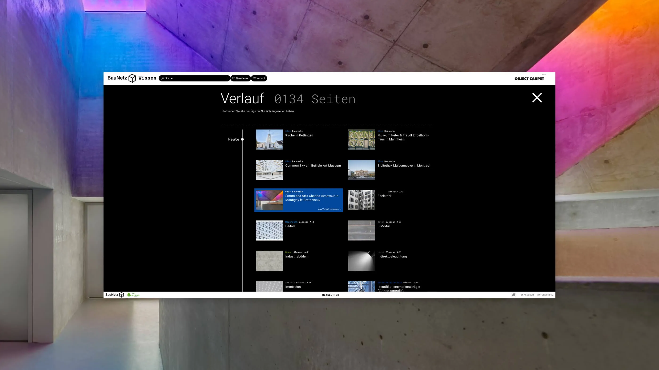
Search protocol and watch list
Other practical functions will also please regular users. For example, your own history is saved and displayed independently of the browser using cookies. A kind of search log. In addition, detailed pages can be collected in a watch list, which in turn can be shared - without the need to log in. This is a function with great potential, especially for the target group (architecture firms, students, etc.), as construction planning is always teamwork. In addition to the sharing functions, the familiar external surfing tips and newsletter subscription suggestions have been retained.
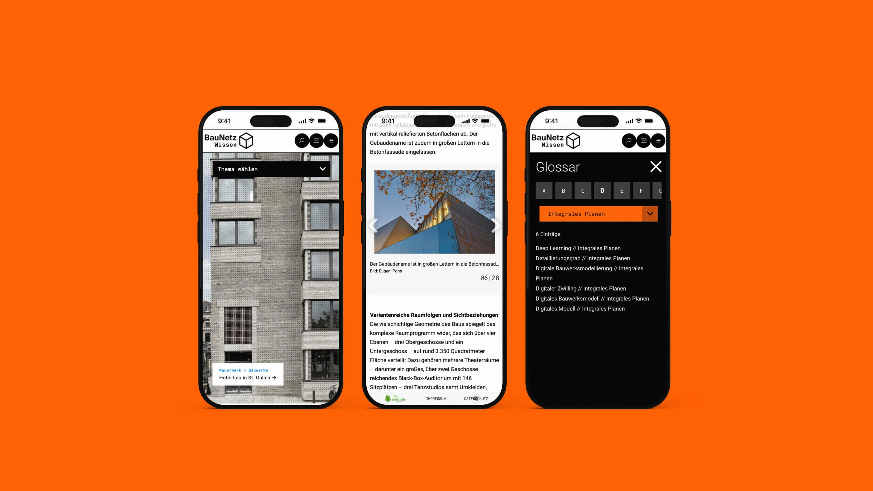
Mobile, of course
The mobile version of the site relies on a structural optimization of the navigation, as the dynamic version of the desktop naturally does not apply here. Otherwise, the entire site naturally plays by responsive rules and makes no compromises in terms of content.
Tech
Speaking of mobile. Technically, of course, the whole thing is not without its problems. Our developer relied on headless CMS for the project, i.e. independence from the actual content management system. The front end itself is a complete in-house development based on Slim and Twig. A little Ajax is still needed, but that's normal, the magic is done.
Typo
Typographically, two levels are taken up: the lexical or technical level of the page, for which a monospace font (Roboto Mono) is used. And the somewhat more "magazine-like" level, e.g. detail pages, for which a normal style was chosen (Roboto).
Design
Another important theme is the grid of dots in the background. A familiar stylistic device, now used even more dominantly, which alludes to the themes of precision and architecture.
The subject areas are still equipped with a color code, but its application has been handled much more consistently - e.g. in the duplex coloring of the large background images. On the other hand, all meta and function pages have a reduced, white on black look.
Underline
One important content and design element should not go unmentioned: The underscore, a well-known symbol for the technical, thus fitting as a metaphor for a digital compendium, as well as the classic "gap filler" in file titling, has made it from a design element into the logo of Baunetz Wissen. And there it connects the logo with the search field, i.e. the entire website, with the content tailored to interests - a strong metaphor!
Conclusion
The result is a project conceived, designed and programmed by us in the frontend, which takes the supposedly dry topic of encyclopaedias to the next level, visualizing and animating it in a contemporary way. This is mainly due to the fact that BauNetz has been a loyal and trusted customer for many years and is prepared to go the extra mile in terms of innovation and perfection. Issues that have already guaranteed a convincing, pioneering end result in projects such as Designlines or uncube.